11 examples of using email countdown timers to increase conversions
 Panagiotis, Customer Support team.
You need to create a sense of urgency for your subscribers but you don’t want to stress them out! It’s time to use a countdown clock in your email.
Urgency works when things need to get done, which is why email countdown timers are so effective for getting subscribers to act.
From buying products that are on sale for a limited amount of time to registering for an event before the guest list closes—countdown timers make it happen.
In this article, we’ll show you the best ways you can use countdown timers in emails to give readers a visual, stress-free reminder that they need to take action straight away.
What is an email countdown timer?
An email countdown timer is an animated GIF image that counts down to a specific time. It’s a ticking clock that you can insert anywhere in your newsletter to create a sense of urgency—just like in this campaign by Forever 21 below.

When should I use an email countdown clock?
Countdowns aren’t just for your homepage anymore! The main idea behind email countdown timers is to make your subscribers act straight away, before they miss out.
For example, you could set up a GIF countdown timer for:
A special offer or promo code which will expire soon
An upcoming event or webinar
A giveaway that’s about to end
A seasonal event, such as Christmas or Mother’s Day
A personalized birthday email
A limited edition product
The motivational power of email countdown timers
We all need urgency to take action. Marathon coming up? That 6 AM pre-work run actually becomes a reality. Your colleague sending you a second reminder about your deliverables? Start the Pomodoro timer already!
It’s exactly the same with email countdown timers: they create urgency, which makes people commit to change and focus on what needs to be done.
“Urgency is a combination of thoughts, feelings, and actual behavior.”
Countdown timers are a stellar addition to your email cadence strategy, because:
They create a sense of urgency: Many customers will procrastinate before making a purchasing decision. A ticking timer may motivate them to seal the deal before they run out of time! FOMO (fear of missing out) is a major player here.
They boost click rates and conversions: One company found that when they added an email timer to their Black Friday promotion, their conversion rates increased by 400%! That urgency and FOMO will compel people to take action.
They’re a visual reminder: There’s something about a live countdown that really gets your neurons firing! If you want to present time-sensitive information in a more visual way, then countdown timers are the way to go.
Dynamic timers in newsletters emphasize the urgency and visually show email subscribers how much time they have left. It also helps readers plan, take action and get excited about what’s to come!
You can also use them as teasers and build anticipation for a surprise product, update or event that’s coming up soon. This gives your audience time to set their budgets, put the date in their calendar and get ready for the big reveal!
Take this email marketing campaign from OVO, for example. It offers a limited-time offer to its subscribers.

To enhance the sense of urgency in emails further, you can also use:
Deadlines
Time-sensitive language such as “only today” or “just a few days left”
Scarcity sentences, like “limited supply only”
Clear call to action (CTA) so your readers know exactly what to do
A subject line that implies urgency
How to embed countdown timers in your emails
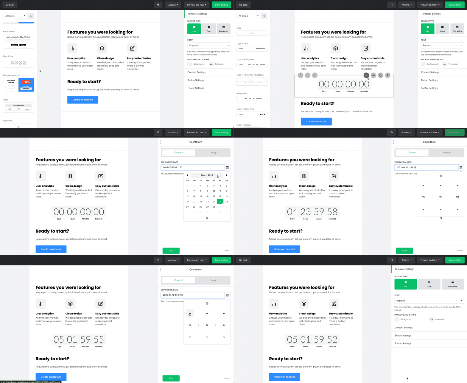
You don’t need to be an HTML code expert or a design guru—it’s easy to embed countdown clocks to your email template. And you don’t need a third-party tool to do it! MailerLite has a countdown block that you can drag and drop directly into your newsletter.

Here’s how it works:
Open your draft campaign in the drag & drop editor.
Locate the countdown block in the left-hand menu.
Drag and drop it into the desired position in your email.
Click the countdown block to edit it. You can then specify the end date and time it will count down until, and customize the background color and countdown style.
Before the newsletter goes out, send yourself (and a friend) at least one test email to see how it looks in your inbox.
MailerLite’s software will set the countdown time based on the timezone of the sender (that’s you). You can always edit your timezone by visiting Account settings and selecting Company details.
To learn more about embedding countdown timers in your emails, check out this great video tutorial from Marcin:
When in doubt, test!
Unsure whether your audience will react to countdown timers or not? Run an A/B test! This is where you send two versions of your email to a sample of your audience. The ‘winner’ with the most opens or clicks will be sent to the rest of your subscribers.
For example, to see whether a countdown timer generates more clicks in emails, you could:
Create an A/B split campaign in MailerLite and select a Content A/B split test to compare the email content (you can also test subject lines and sender information)
Create two versions of your campaign; one with a countdown timer, the other without
Select the sample size and testing time, and opt for the winner to be chosen by clicks
Hit ‘send’. Your test emails will go out, and a winning version will be selected either manually or automatically after the testing time is complete
For more inspiration on what to test in your emails, take a look at these 12 A/B testing examples.

MailerLite’s drag & drop newsletter editor includes interactive email blocks like videos, countdowns (of course 😉 ), surveys, and more to catch your subscribers’ attention.
11 examples of using email countdown timers effectively
Without further ado, let’s jump in and see some real-life examples of countdown timers in action.
1. Limited edition or product release
When things are new or exclusive, announce it in a festive setting. In real life, this might happen with a launch party. In the email world, this means an eye-catching email template announcing the release.
In this email, Sesli gets its subscribers ready for their new showroom, which is opening in Fourways, South Africa. The countdown clock works well to help people visualize the days left until the launch date.

2. Voucher redemption
Discount coupons are an excellent tool to get people to sign up for your list. Though not every subscriber is ready to order the moment the voucher arrives in their inbox.
Make the discount coupon available for a limited time only to motivate people to browse your shop. A personalized email countdown timer with the reader’s individual expiration date is not only helpful but also boosts conversions.
The marketers at BodyCandy use this trick to remind people in real-time to use their discount code.

3. Seasonal events
Black Friday, Cyber Monday, Mother’s Day, Boxing Day—we all love a good sale! Create a buzz by counting down to major seasonal events and tease subscribers by giving them a sneak peek of your jaw-dropping offers.
You can implement a countdown timer in the announcement email campaign, as well as right before the end of the promotion.
An example from Harber London shares the countdown until Father’s Day. The background image in the email speaks for itself, and it drops a good hint for anyone who needs some gift inspiration!

4. VIP or early access
One of the many perks of email marketing is that your campaigns are exclusively sent to those on your email list. Spoil subscribers by giving them early access to VIP affairs or flash sales. This makes them feel like they’re part of a members-only community.
In MailerLite, you can also add countdown timers to landing pages. Redirect the CTA link in your “early access” email to a landing page that contains a countdown and password. This will make subscribers feel like true VIPs.
This email countdown example from EKWB announces early access to their new product, giving their VIPs a 24-hour head start to pre-order. Note in the design how the countdown timer has the same background color as the rest of the email; making it flow seamlessly with the rest of the newsletter.

5. Webinar or live stream
In most cases, only a percentage of those who’ve signed up for your watch party, webinar or live stream will actually attend. That’s why it’s important to remind people about your online get-together.
Countdowns work super well in online video event email sequences. Most organizers send 3 emails—a registration confirmation email, a reminder a couple of days before the event and a final notification 1-3 hours before going live.
MailerLite users can promote their event or webinar via event countdown emails and directly on their website. With our countdown pop-ups, you can install a pop-up on any page that will let readers know in how many days, hours and minutes your event or webinar is happening.
This newsletter example by the Indiana Black Expo shows you how to use a countdown timer in your next event email.

6. Price changes
When you know the price of an item that you want increases tomorrow, do you wait or make the purchase today? Our guess is that you’re already on your way to get your credit card.
We’re wired to feel terrible about losing money. Use this to your advantage by making readers feel like they’ll pay more the longer they doubt their decision.
No7 sends a final reminder that their special offer and freebie is about to end.

7. Sale ends soon
You’ve probably seen them in your inbox: The “hurry up the sale is ending soon” countdown newsletter. Stores use them for a reason. The counter makes the email interactive and tempts the reader to snatch their favorite pieces before it’s too late.
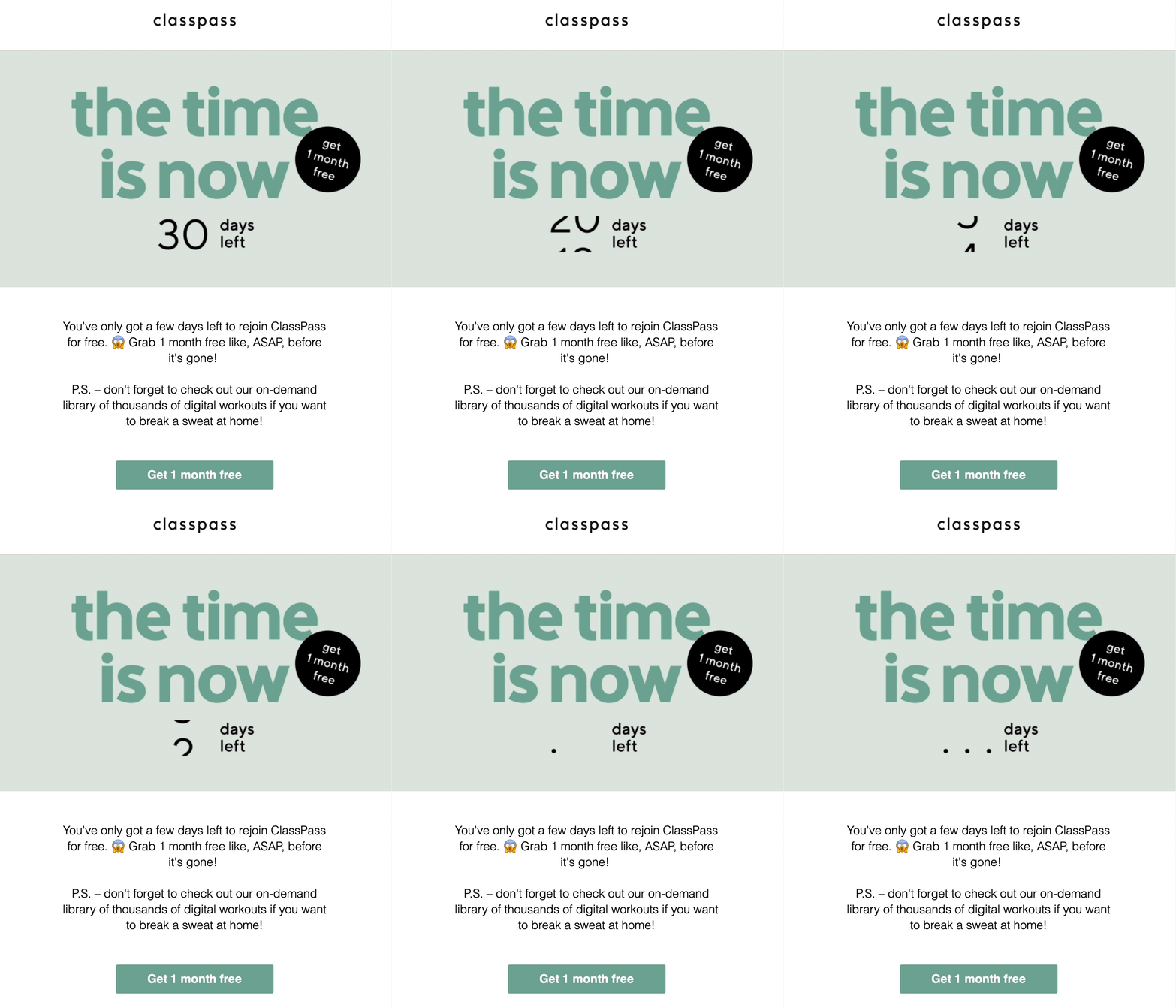
We love this countdown timer example which shows ClassPass fans that they only have a few more days to snag their free membership.

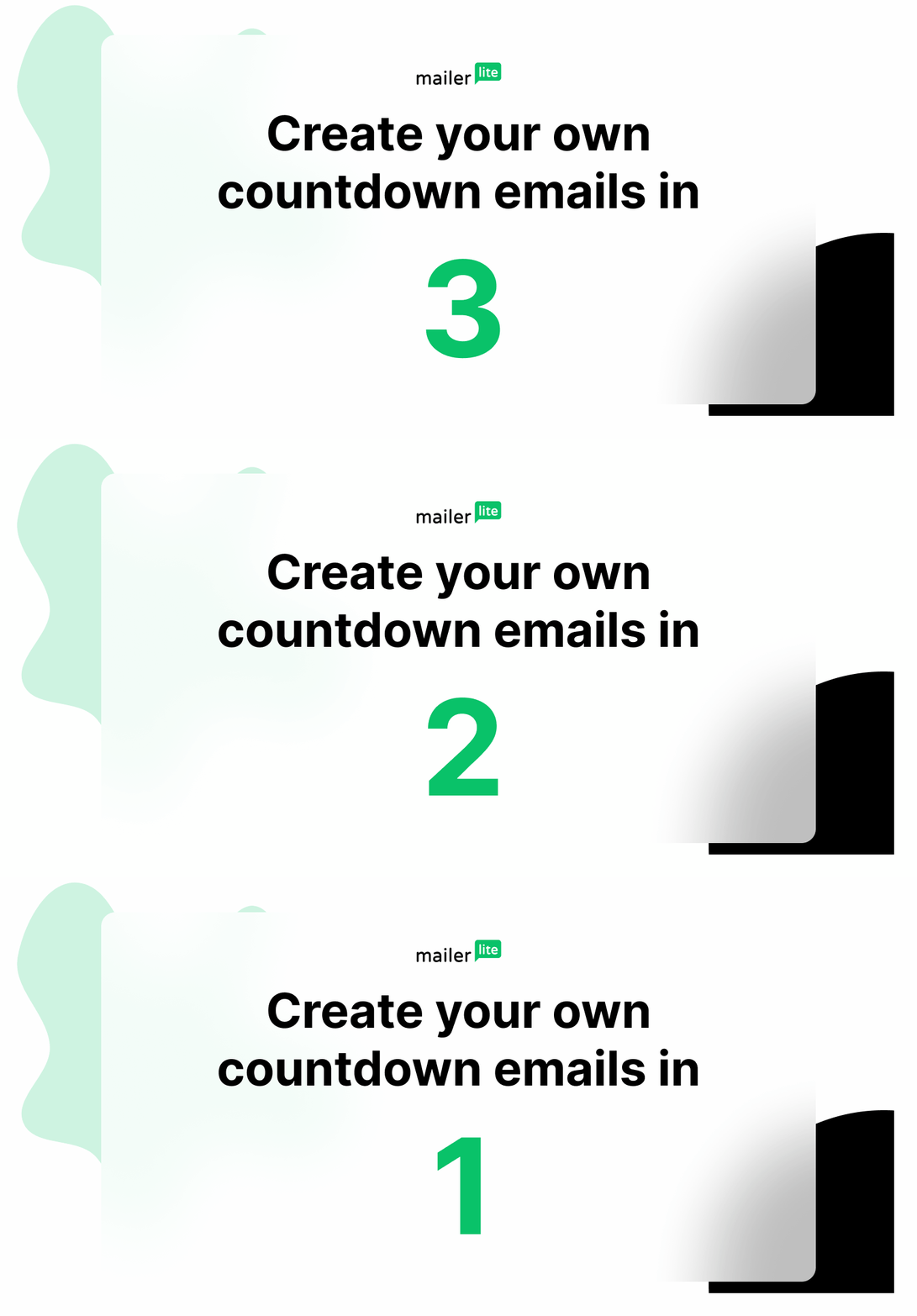
Note: Your countdown timer doesn’t have to end at a specific date. To create a more general sense of urgency, you could create a GIF that says, ‘Access the sale in 3… 2… 1…’, for example, and embed it in your email.
8. Abandoned shopping cart
An abandoned cart email on its own already amps up conversions, but with a countdown timer implemented it’ll have twice as much influence.
E-commerce sites send these types of emails when a customer puts an item in their basket but leaves without completing the order. By sending a basket reminder email, the chances of customers finishing their orders are much higher.
Now imagine you also add a timer. Offer the reader to take over the shipping costs or give a discount when the customer converts within a limited time. Now your email will have double the power—just like in this countdown email example by YourStore!

9. Freebies
Free stuff, anyone? Yes, please!
Giving away free, useful gifts to readers nurtures the relationship. These gifts can be anything from downloadable guides to discounts and physical presents.
A countdown timer, as used in the example below by DCT UK, can increase the click-through rate as readers need to act fast or they’ll miss out. Plus, we love the use of animated GIFs in this email!
10. Course promotion
Did you put together a course but the rate of enrollment is a bit slow? An automated email sequence can help promote your work.
To promote your course via email, you can create a workflow containing:
Course announcement
Early bird registration for a special price
Hurry! The prices will go up soon
Pricing has gone up to the normal rate
Last call for enrollment
Take a look at this email countdown example from Girl Boss Mag. They use a countdown to get readers to sign up for their course before registration closes.

11. Contest
Running a contest? Countdown timers are the email accessory you need!
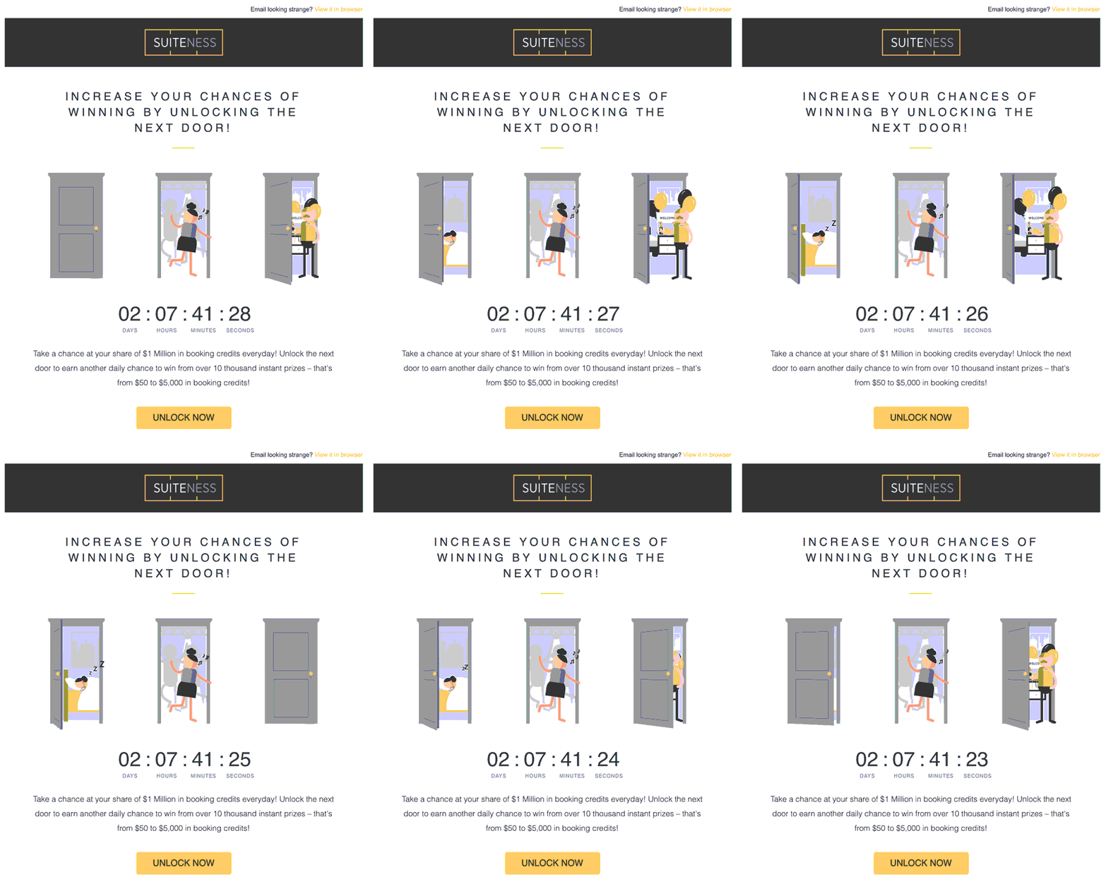
This email by travel company Suiteness is a perfect example of an email contest done well. It’s beautifully designed, interactive and a fun take on using a countdown timer. Plus, we’d definitely try our luck to win a share of $1 million in booking credits.

What you need to do in 3, 2, 1…
Time is ticking! Countdown email timers are interactive, engaging, and super effective. Implementing timers in your email design is easy and can positively influence your conversions.
So, what are you waiting for? Tell us in the comments how you’ll use a countdown timer in your next email.
Editor’s note: This post was refreshed in February 2021. It has now been updated with new tips and examples for 2022.
Create your first campaign in minutes
Test how easy it is to set up a countdown timer for free!
