5 visual trends for 2022: From 3D illustration to retro photography
 Sofia, a member of our Customer Support team at MailerLite.
There are more emails being sent out now than ever before. If you want to stand out in your customers’ feeds and inboxes, you gotta keep up with what’s trending!
In digital marketing, email has become one of the go-to communication and marketing channels for businesses looking to engage with customers throughout lockdowns. As a result, more people are active on these channels than ever before.
We’ve seen plenty of visual trends blossoming this year, and they all seem to be centered around the same core principle: eye-catching imagery with heart and humanity. Let’s dive in and explore the top trends dominating digital marketing.
1. 3D illustration
3D illustration has become one of the biggest visual trends of the past few years. It offers unlimited artistic possibilities—allowing designers to replicate real-life objects or even produce 3D creations straight from their imagination!
As a trend, 3D design first surfaced back in the early 2000s, but at the time it was considered cutting-edge technology that helped to transform industries such as graphic design, television, and engineering. Fast forward to 2021, 3D illustration is now accessible to anyone and it’s the perfect way to make your digital marketing campaigns stand out.

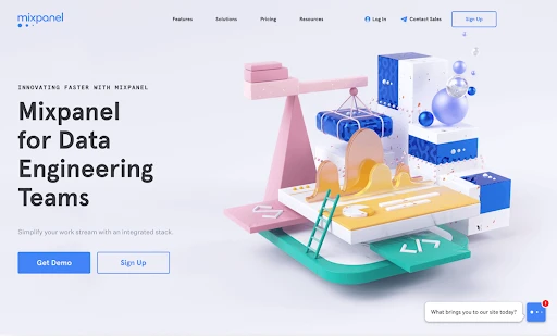
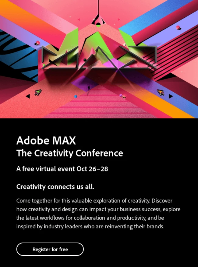
Many artists and designers are now opting to turn their 2D illustrations into larger-than-life artworks. An example of this is Jeremiah Shaw, who uses 3D illustrations to create fun, colorful infographics for companies like Mixpanel.
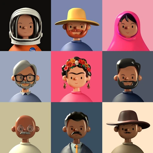
We’re also big fans of 3D illustrator Amrit Pal Singh, who has become sought after for his charming Toy Faces series, illustrating the likes of Daft Punk and Frida Kahlo.
With a wide variety of uses and applications, 3D illustration is now being featured everywhere from email, social media, infographics and slide decks to magazines, product design and advertising campaigns. It’s also regularly used for websites, billboards, and animation, demonstrating the versatility of the trend.
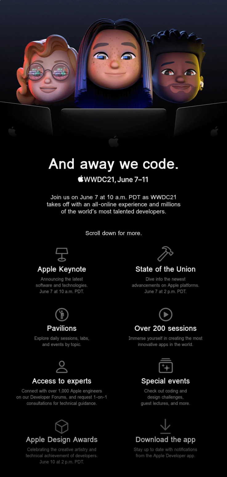
Plenty of big brands—such as Apple and Adobe—have caught on to the popularity of 3D illustration as a way of adding depth to their emails, design assets, interfaces and digital communications.
2. Y2K design
There’s no denying that the early ’00s was an iconic decade defined by many bizarre trends and styles. As fun as it is tacky, the “Y2K aesthetic” is officially back in vogue.
In design, the “Y2K” look typically features bright, obnoxious colors, kitsch textures such as plastic, metallics and faux fur, and bling as far as the eye can see.
Initially, the look was inspired and influenced by the world’s increased focus on technology, gadgets and of course, the Internet at the turn of the new Millenium. Centered heavily around both pop culture and cyberspace, the style of the ’00s was bright, shiny and futuristic.
Y2K design is definitely back in 2021, as brands, creators and social media users alike rediscover the charm of this showy-yet-familiar style. Like many trends do, the resurgence of Y2K design began on social media—TikTok in particular. The noughties trend has dominated the short-form video app, quickly spreading to other platforms and into the wider world of digital marketing.
Modern Y2K Design features many iconic elements of the original trend—such as bright colors, bold textures, pop culture, and cyber-inspired fonts and imagery. It also draws from other design trends such as anti-design, brutalism and collage.
Out in the wild, Y2K design is being used by plenty of big brands, businesses and trend-setters.
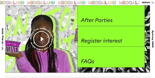
For example, the Australian makeup brand Mecca took inspiration from Y2K for the design of its Meccaland website. It features bright colors, bold illustrations, sketchy collage, and even kitschy textures such as foil, plastic and paper.

Sparkling water company Recess has also revisited the noughties in their email marketing campaigns, with their designs featuring pastel gradients and nostalgic cyber-inspired imagery.
3. Collage
One of the biggest visual trends of the past few years, the crafty art of collage is still taking both the graphic design and social media worlds by storm.
In a nutshell, collage is an artform based on mixing mediums such as photos, illustrations, typography, graphics, motion, and natural textures to create an eye-catching aesthetic. It lends itself perfectly to digital marketing due to both its visually pleasing nature and the ability to communicate multiple concepts at once.
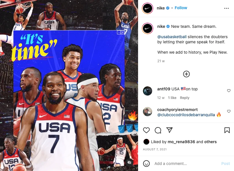
Collage has become particularly popular on social media, with many digital collage artists taking to Instagram to share their work. The Brand Kit, Labyrinth of Collages and Journal Bean are all well known on Instagram for their creative collages, which often mix mediums such as illustration, photography and typography to create a delightful effect.
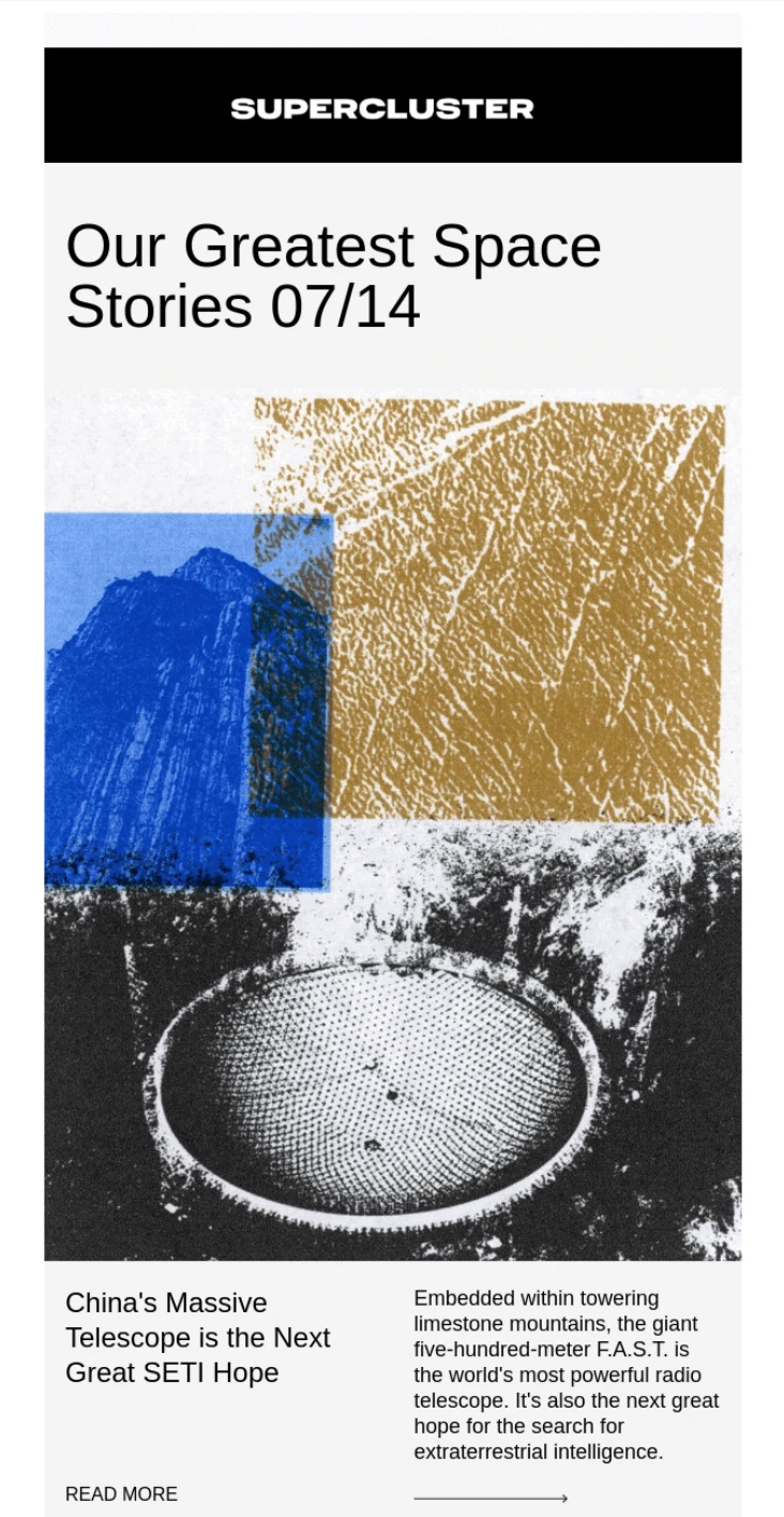
This trendy mixed media style is also being adopted by many brands—including the likes of Nike, Packlane and Supercluster—in their digital marketing materials, social media content and email marketing, to attract creative-minded customers.
4. Retro design
A retro revival back in 2019 saw retro trends from the 60s, 70s, 80s and 90s dominate the creative landscape, and infiltrate everything from graphic design and marketing to pop culture.
The popularity of vintage cameras and retro photography has skyrocketed over the last few years, driving a comeback of analogue-style photography. Whether achieved with a genuine vintage film camera or created with apps that replicate a retro feel, the retro photography trend is designed to emulate a nostalgic aesthetic that transports viewers back in time.
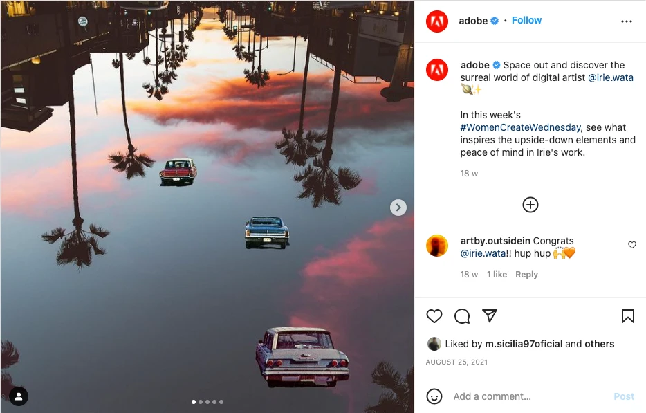
Often featuring retro characteristics such as light leaks, flares, scratches, grainy photo quality, date stamps and even Polaroid frames, the vintage photo aesthetic has become a massive trend on social media. Brands such as Adobe and Nike are all jumping on the retro photography trend, using vintage visuals in their Instagram content and email marketing material.
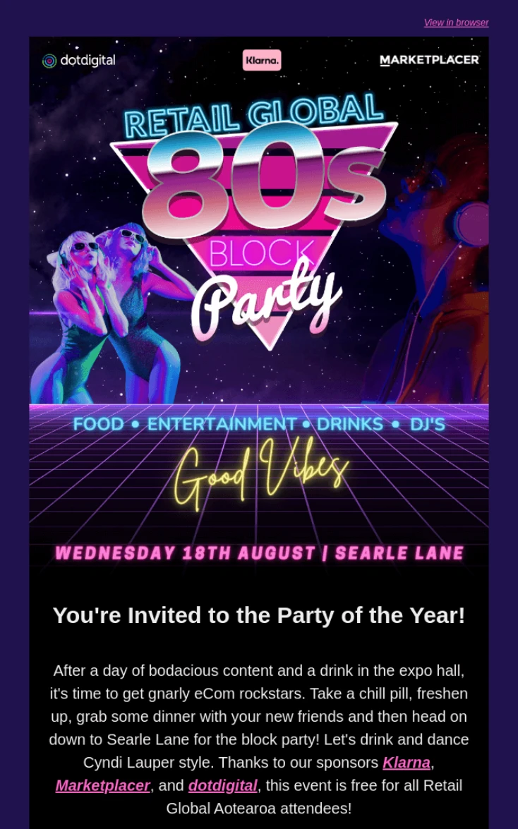
In addition to retro photography, many brands are also featuring 70s, 80s and 90s design elements in their digital marketing comms—as seen in this 80s inspired email by Retail Global.
5. Pastel colors
Pastel colors have been hot on the scene over the last couple of years, trending everywhere from graphic design and photography to fashion and social media. Pastels are also a popular color palette in email design—particularly in retail.
Pastel colors are light yet bright hues with a silky, dreamy appearance. Derived from the traditional art medium of the same name, pastels are usually soft and soothing in tone due to their low saturation and subdued colors.
They’re often associated with spring and work well when paired with neutral colors. With more and more people switching to dark mode, pastel colors can be a great tool for digital marketers who want to catch their customers’ attention and add a pop of color to their comms.
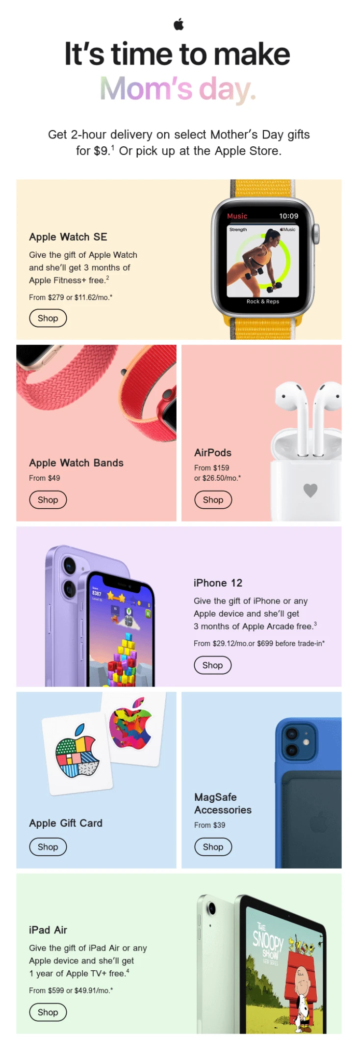
The pastel design trend has become universal across many industries. Even tech giant Apple has jumped on this trend, sending out pastel-colored emails to customers despite the bold palette being a far cry from its traditional brand identity.
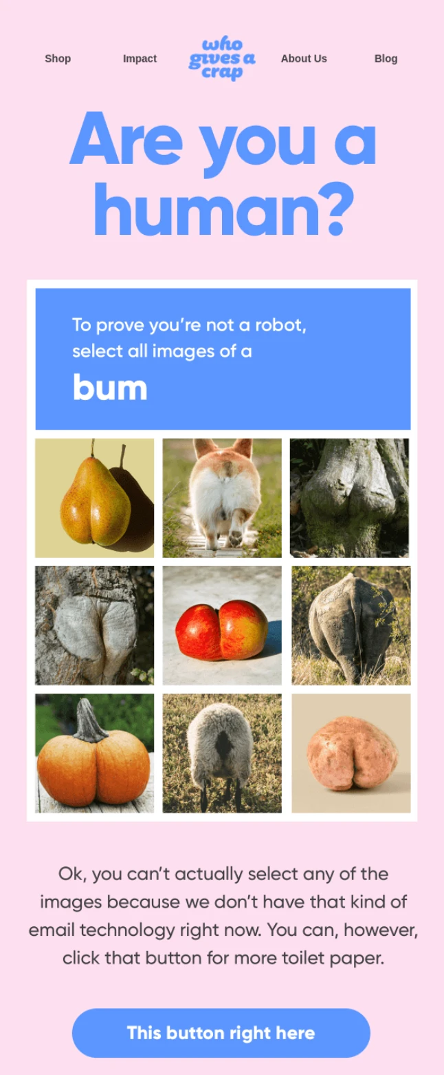
Ethical toilet paper brand Who Gives a Crap is also a master of the pastel color palette. They incorporate the soft hues in their email marketing to make their toilet-based products a little more, well, palatable.
And that’s a wrap!
We hope that this article helped you find some inspiration for your next email or digital marketing campaign. From 3D illustration and pastel palettes to collage and retro photography, there’s no denying that all of the big visual styles trending in 2022 are eye-catching, creative, and sure to help you stand out in your followers’ feeds and customers’ inboxes.

Kelsie is the Editor of the Envato Blog. An expert in the fields of writing, editing and digital marketing, Kelsie is a connoisseur of all things creative and enjoys writing about everything from design, art and music, to social media, advertising and digital trends. Above all, Kelsie loves telling the stories of people doing incredible things in the creative community.
