Get more subscribers with our latest feature: form A/B testing 🧪
 Jonas, marketing communications
Generating new email subscribers involves both art and science. Our form builder helps with the art by making beautiful forms easy to create.
We’re happy to introduce our form A/B testing tool in the new MailerLite that simplifies the science. This feature allows you to run split tests to increase the conversion rate of your forms and popups.
You’ll love form A/B tests because:
Set up is super fast: Start with your existing forms or one of our templates. You can have your test live in minutes (seriously).
Analytics are included: We track your tests and display metrics within your dashboard. No need for extra integrations or plugins.
Create multiple versions: You can test up to 5 versions of your form to see which one performs best.
Add forms anywhere: Test forms on any website page by embedding a form or adding a popup.
Design is easy: The process uses our drag-and-drop builder and is similar to a/b testing landing pages or emails. If you use these features, you know what to expect.
Read on to find out more form A/B testing, including how it works, what you can test, and best practices to consider.
Get MailerLite to start A/B testing
Sign up for a Growing or Advanced plan to start a/b testing pop-ups and embedded forms. Advanced plan users can also test promotional pop-ups.
What is A/B testing?
A/B testing is when you send traffic to different versions of a website element to see which performs better based on a predefined outcome. This could be sales, clicks, lead form signups, or newsletter subscriptions.
Once the data shows one element outperforms the other, roll out the best-performing version across your website.
A/b testing is an essential part of conversion rate optimization (CRO). MailerLite has long offered the ability to a/b test landing pages and emails. Now you can also test embedded forms and popups.
Which form elements can you test?
Our website form A/B testing feature lets you edit an existing form or build a new one. You can test any factor you can edit with our form builder, including the design, text, colors, offers, layout, positioning, and more.
Here are 7 form A/B testing ideas to consider optimizing first:
1. Offer
An attractive offer is essential for generating signups. But does your target audience really want free shipping? Or would a 10% discount be more effective? Find out by using form A/B testing to see which offer converts best.
2. Headline
Your headline is the first form element people read. Test versions that highlight different benefits to discover the messaging that best attracts subscribers.
3. Images
The images you choose impact your product's appeal. A/B testing is the best way to find out which pictures customers respond to. Create form variants with different images to see which converts at a higher rate.
4. CTA button
Your call-to-action (CTA) button is your final chance to spur action. Experiment with your messaging to see if presenting your offer in a new way generates a higher conversion rate.
5. Design
You can optimize many design elements with A/B testing. Experiment with the colors, fonts, layout, and size of different elements.
6. Form position
MailerLite lets you create multiple types of forms with different positions. These include:
Featured pop-ups that appear in the middle of your web page
Floating popups that stay at the top or bottom of the page as the user scrolls
Slide-in popups that appear in the corner of the page
Half-and-full-screen popups that customers can’t miss
A/b test different types of popups to see which performs best. Our form builder will automatically change the positioning of your existing elements to fit the new layout.
7. Form fields
Using fewer fields in lead generation forms typically results in more submissions. Find out whether this is the case in your website by creating forms with different fields and seeing how this impacts form conversions.
How to set up form A/B testing in MailerLite
You’ll love how easy it is to create and run A/B tests with MailerLite. Just follow these steps.
Head to an existing form or create a new one.
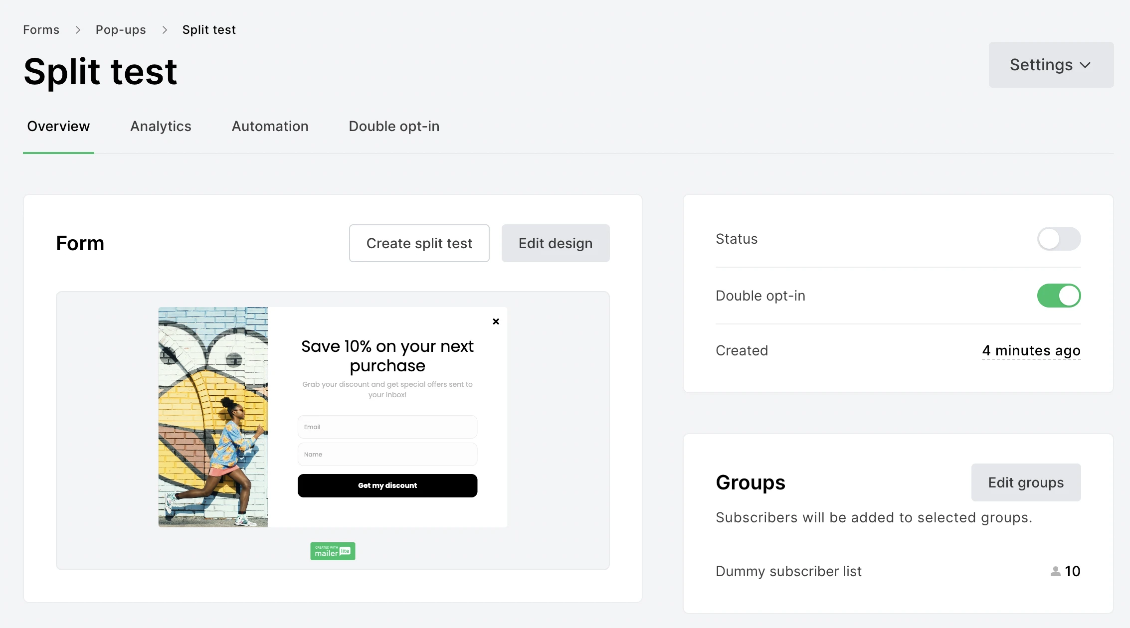
From the overview menu, click Create split test.

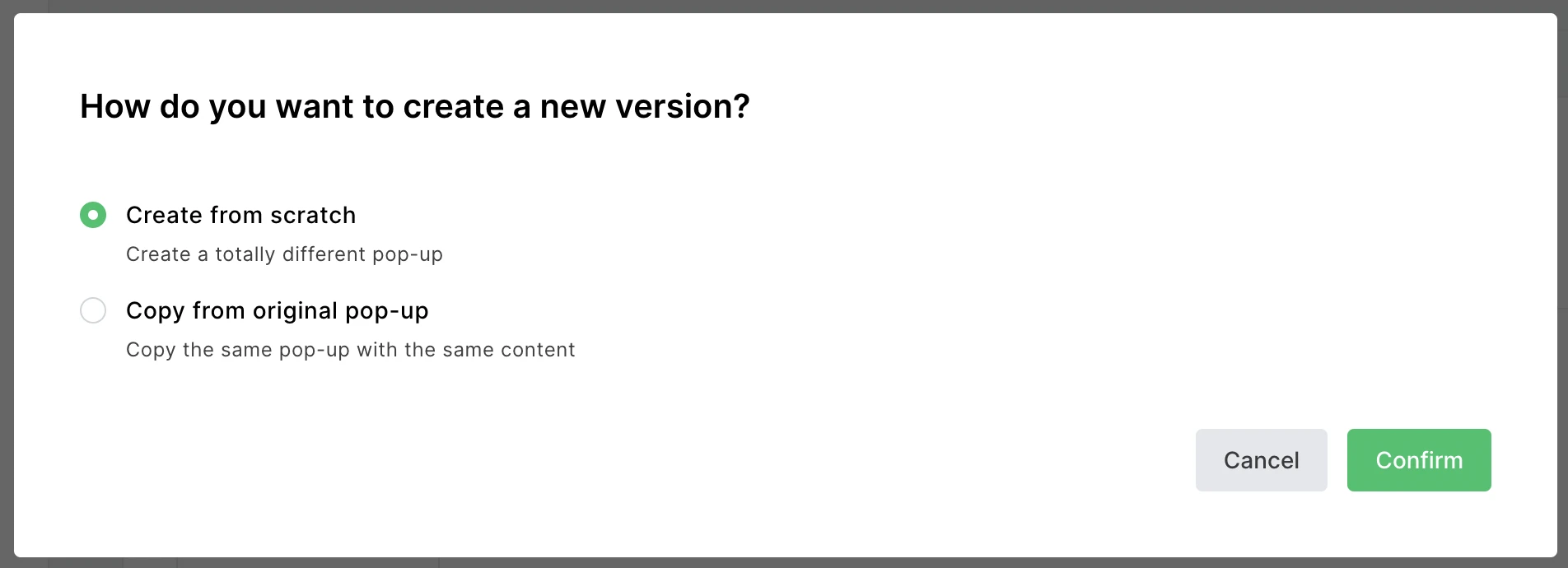
Choose the button to Add more versions and then decide whether to copy the original form or create a new one from scratch.

This will take you to our form designer, where you can customize the new form.
Repeat the process to create more forms if you want to test multiple versions.
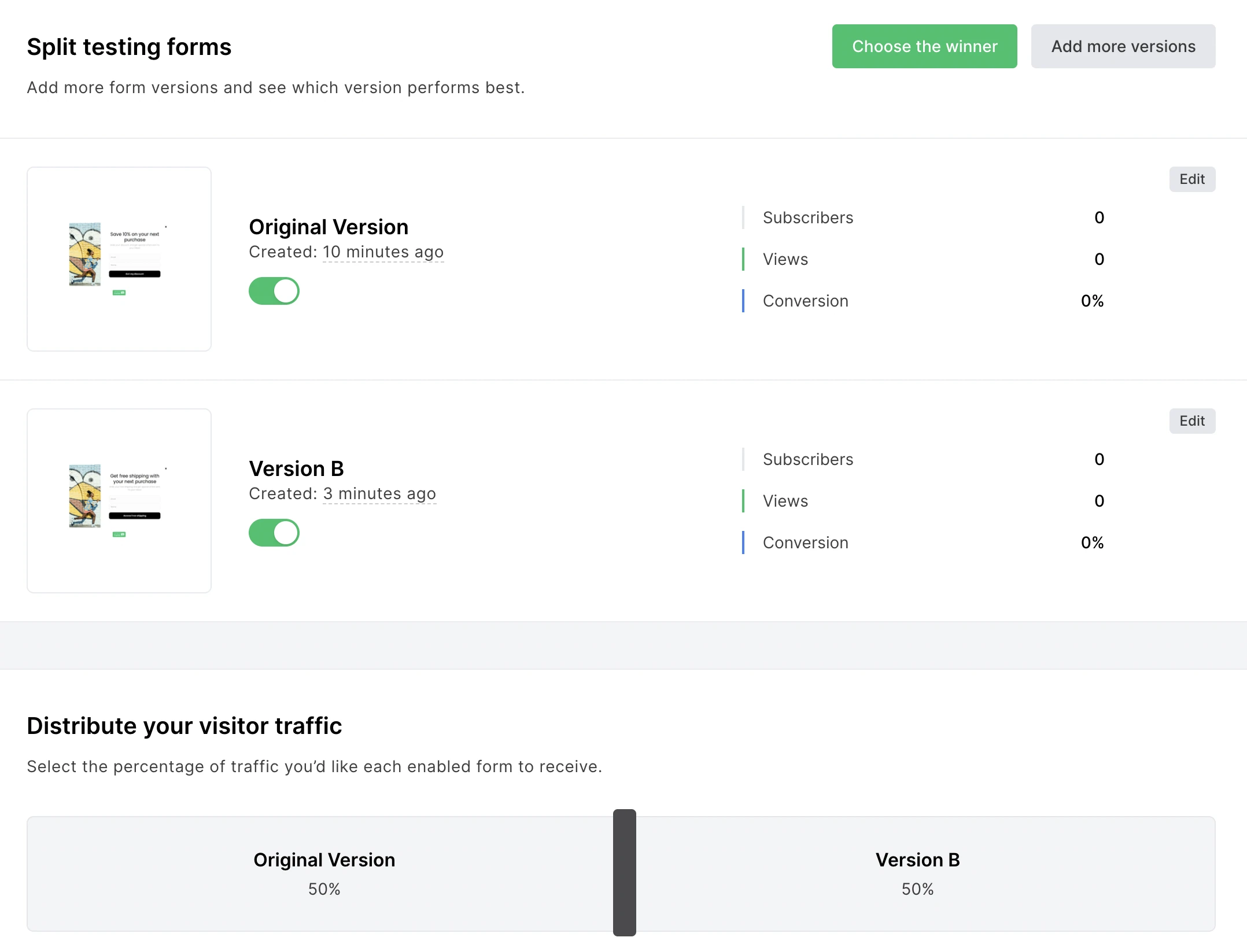
Start the experiment by turning on split testing and then selecting the form versions you want to compare.
Configure how much traffic to send to each version.

Your test is now live; follow its progress in the overview section of the A/B test.
Finish the test by clicking the Choose the winner button and selecting the version of the form that performed best.
Once you’ve followed the above steps, the winning form will be displayed to all visitors.
Tips for running an effective A/B test
It’s tempting to start right away when the A/B testing process is this easy. Before you do, consider these best practices to ensure you generate results.
Set a hypothesis
Create a clear A/B test hypothesis to focus on a particular goal. Include these three sections in your hypothesis:
The variable is the form element you will change.
The outcome is the result you expect to see.
The rationale is why you think changing the variable will generate the expected outcome.
Create a hypothesis by putting these elements together like in the example below.
The following hypothesis is for an A/B test to see whether an offer focusing on benefits will generate more conversions than one focusing on price.
We believe that (1) focusing our headline on the value of our product rather than the free trial will (2) increase the conversion rate of our pop-up form because (3) research shows that focusing on a product’s value can be more persuasive than focusing on the cost of the item.
Reach statistical significance
Statistical significance shows how likely it is that your test results are due to the changes you made, not luck or another factor.
For example, a form may outperform another over the first 24 hours but balance out over the duration of the test. Checking for statistical significance ensures you don’t come to conclusions prematurely.
Use a statistical significance calculator to discover whether your results meet the criteria.
Test one element at a time
Only change a single element, for example, the headline, on each version of your form. If you change multiple components, for example, the headline and the image, you won’t know which part of the form is impacting the results.
Start A/B testing now
A/B testing your forms with MailerLite is ridiculously easy, and the potential upside can be huge. Start by heading to your dashboard, choosing a form to test, and creating a new version.
Start your first A/B test today
Hit the link below to head to your dashboard and start A/B testing your forms. Your test can be live in minutes!
