Crafting accessible content: What you need to know

Accessibility is a big deal. With 15% of the world’s population facing a disability, and at least 1 billion people experiencing visual impairments, you need to think about the accessibility of your online content.
Accessible content simply means that your websites, landing pages and emails are designed in a way that takes into account people with limitations, such as physical disabilities.
For example, people with visual impairments may rely on screen readers. These devices will read text aloud and navigate through the content. If your email or landing page isn’t optimized for this, then someone who is blind or has low vision may not be able to access your content.
More and more laws are requiring people to create content that is adapted for people living with disabilities. But don’t worry—we’ve written this article to help you navigate the new guidelines with ease!
Making your content more accessible
People living with any physical or cognitive disabilities have the right to access information, the same as anyone else. And we want our content to be as accessible as possible, so that we can reach a wider range of subscribers. It’s a win-win! In fact, some countries have already made it the law.
For example:
US-based companies should make their email marketing accessible according to the Americans with Disabilities Act.
Ontarian companies must comply with the Accessibility for Ontarians with Disabilities Act, which comes into force on 1st January, 2021.
The latest standard on content accessibility is officially called the Web Content Accessibility Guidelines 2.1. (or WCAG 2.1. for short). This standard was created by the WAI (Web Accessibility Initiative) with the goal of making the Internet an accessible place for everyone.
At first, you might worry that adapting your web page content could take too much time. However, in the long run, these changes will make your newsletters and landing pages look more logical, and they will also be easier to understand and read.
Accessibility isn’t just for people with disabilities, it’s about creating a simple, straightforward user experience for everyone. Like we said before, it’s a win-win!
We know how important it is for our clients to be accessibility-compliant, and we’re continuously developing our service to make it as easy as possible. All you have to do is stick to these 7 guidelines to make your websites, landing pages and email newsletters more accessible.
Guideline #1: Use alternative text for visual elements
Keep the most important information in text-form. You might want to be creative and add text to your images. But some people switch off images in their emails, and others with visual impairments may not be able to see or read the image. So the best practice is to share important content in the text.
However, in practice, we like to use visual solutions in our marketing material, right? Some nice pictures always brighten our newsletters and break up the text. Images are a good thing in your newsletter and landing page design, and we don’t want to put you off using them.
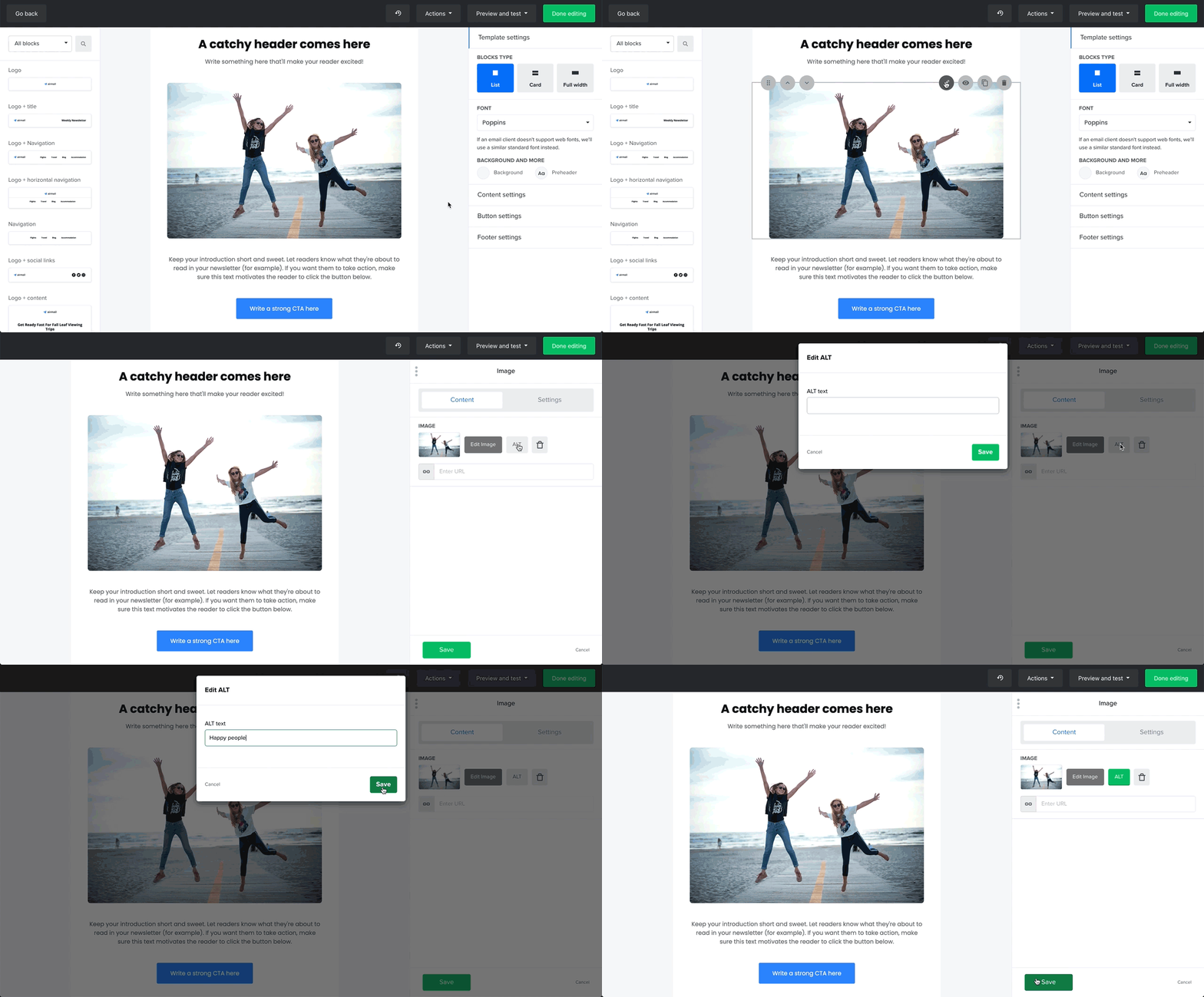
But to help people with visual impairments understand them, it’s important to use alternative text (or ALT text) for the visual elements of your content. When using pictures, infographics, tables, image buttons, input fields and other visual cues, you should include a description of them—or captioning or a transcript if you’re using video.
Descriptions and transcripts should be inserted in the field called ‘ALT’, which you can find when clicking on visual elements in your MailerLite builder, like in the example below:

When creating a description, instead of saying “Image of the bear”, it’s better to use a description such as “Bear walking in the forest”. This gives people a better understanding of what the picture shows.
If you have images or other visual elements that don’t include any content and are just there for decorative purposes, then no alternative text is needed.
Guideline #2: Provide clear instructions
Sometimes we might want to give our subscribers instructions, such as where to find certain pieces of information. Keep in mind that these instructions should not rely on color, shape, size, or visual location, because people with visual impairments might not see them. So for example, try to avoid using instructions such as ‘You will find the information in the red box below’.
A good structure for instructions would be a sentence like this:
Please see the table below called 'Instructions to our clients’ to see our suggestions on how to create cool newsletters.
Guideline #3: Use a logical structure in your marketing material
When you create your newsletter or landing page, keep the information organized in a logical structure. Otherwise, your content may confuse or disorient users when assistive technology reads it in the wrong order.
Having a logical structure is especially important when using multi-column templates. The content should flow from the top of the column to the bottom of the column, before going to the top of the next column. This is how assistive technologies will read your columns and tables.
When using a longer text with multiple sections, make sure you use headings for every new paragraph. Headings are structural elements that help define your content's hierarchy and improve its readability and usability. This allows people using assistive technologies to navigate through your newsletters or landing pages and find the right information.
To add some clarity to your marketing material, we recommend adding descriptive subject lines in your emails and descriptive headings in your landing pages to inform your subscribers about the content they’ll find in it.
To save time, you can always use our ready-made newsletter and landing page templates. They’re already set up in a logical sequence, so they’ll be easy for everyone to navigate.
Guideline #4: Have descriptive input forms
Input forms—such as signup forms— are a useful part of our marketing toolkits. However, there are some things to keep in mind when using them.
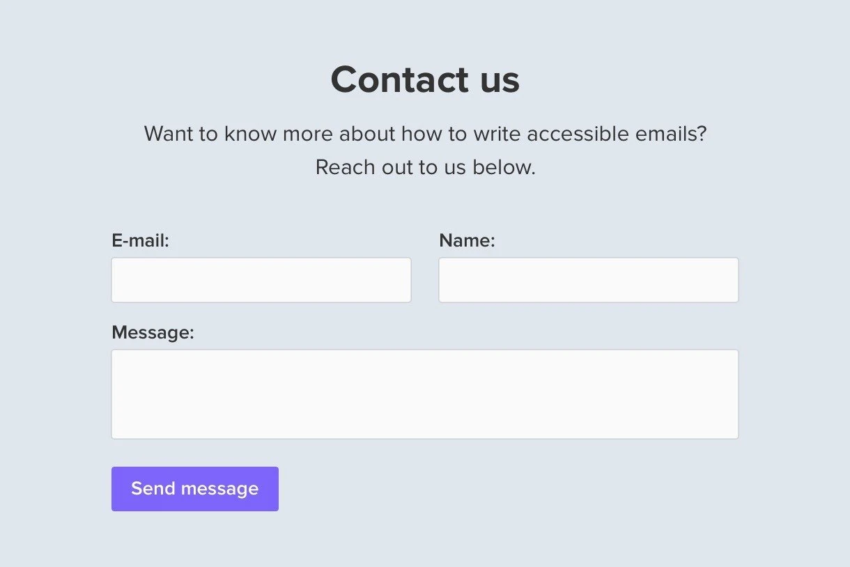
If you have an input form (for example, a signup form on a landing page) where you ask for someone’s contact information, then make sure you explain what it’s needed for. Also, check that each input field is clearly labeled, so that it’s easy to enter the correct information.
Use this contact form below as an example. It describes exactly what the information is needed for (to learn how to write accessible emails), and it explains which fields the information should go into (email, name and message). People using assistive technologies will understand the purpose of the input form, and know what information should go in each field.

Guideline #5: Adapt the links in your text
We often add links to our newsletters and landing pages. But did you know that using just a different text color is not enough to highlight the link in an accessible way?
When you want to distinguish the link in your text, you must have a color contrast ratio of at least 3:1 between the link and the surrounding text. You also have to include an additional distinction, such as by underlining the link as well.
When we talk about links, it’s important to explain the purpose of the link. People should know exactly what will happen when they click on it, and they should be able to determine this from the link text alone.
For example, information about the link can be written like this:

Notice how the sentence explains exactly what the link is for. The word 'link' should also be marked in a color (using a ratio of 3:1) and underlined.
Guideline #6: Use the right contrast ratio for text
Have you ever received a newsletter where the text color was almost the same as the background color, and it was almost impossible to read it? All of us have experienced this at least once. That’s why these contrast ratio special requirements were released.
Just remember that text and images of text should have a contrast ratio of at least 4.5:1. But if you’re using large text (typically 24px) or 18,66px text in bold, then a contrast ratio of 3:1 is enough.
A contrast ratio of 3:1 should be also used for other graphic objects such as icons and components of charts or graphs, as well as interface components such as buttons, form controls, and so on. This contrast requirement is not applicable to logos or brand names.
To better understand the contrast ratio, here are some examples:

As you can see, when the text and background color have a contrast ratio of at least 4.5:1, it’s much easier to read, right?
You can check the ratio using free tools like WebAIM's contrast checker.
Guideline #7: Text should be seen when zoomed out
It is important to make your content readable and functional when the page is zoomed to 200% so that people with mild visual disabilities can read the text without assistive technology.
Your accessibility cheatsheet
These are the main things you need to know to make your newsletters and landing pages accessible to more of your subscribers. Not only will people with disabilities be able to access more content, but you’ll also be able to reach a wider range of people with your marketing campaigns—and who doesn’t want that?
In case you need a reminder, here’s a checklist for designing accessible web content in MailerLite:
✅ Avoid adding text to images, as much as possible
✅ Use descriptive ALT text for images or transcripts of videos, so that everyone can understand what they show
✅ Follow a logical formatting structure, so that assistive technologies can read the content correctly
✅ Include descriptive subject lines and headings
✅ When using forms, clearly explain what they are for, and where the information should go
✅ Have a color contrast of at least 3:1 for links, and underline them as well
✅ When using text and image text, have a color contrast of at least 4.5:1, and at least 3:1 for other visual elements
✅ Make sure your text is still readable when you zoom to 200%
With so many new laws and regulations appearing, it’s best to keep your email and landing page content as accessible as possible. Follow these accessibility tips, and your content will be optimized so that everyone can enjoy it. Happy designing!
