Your guide to email signature best practices (with examples)
 SEO Team Lead Paulius smiling in Italy.
Your email signature is your final chance to leave a strong first impression and encourage subscribers to engage. This means it has much more power than you might think!
It lets people know who you are, what your business is about, and makes it easier for them to contact you. So it’s important to consider how you can optimize your signature to reach your business goals.
With these email signature best practices, the last thing subscribers see will no longer be an afterthought. Here’s how you can get ahead of the game and create your own amazing email signature!
What is an email signature?
An email signature is the sign-off you use at the end of an email. They contain information that helps subscribers learn more about you—kind of like a business card.
You can also use email signatures to:
Supply additional contact information
Easily brand every message
Include hyperlinks to other marketing channels such as your website, social media, professional network, and more
Encourage responses and increase engagement
Increase conversions
Verify your credibility with the addition of award/certification badges
Show professionalism
Show your personality and have a little fun!
What to include in your email signature
Email signatures are sometimes referred to as email footers, and they can include a lot more than just your name. Depending on the nature of your business and your relationship with your subscribers, there are various elements you can and should include.
Essential components of an email signature
You’ll want to include these important elements in your HTML email signature, no matter what!
1. Your name
Whether you’re signing off as a team or individual, it’s important to let your subscribers know who’s emailing them.
2. Your position
This could include your job title, team, department or, if you don’t have an official title, a good description of what you do or your affiliation with the business. Adding your position helps to reinforce your authority on the subject matter, and gives context to the email and you as the sender.
3. Company name
Adding your company/organization name helps people understand who you are and strengthens brand awareness.
4. Contact information
Sure, your contacts could just reply to the email! But that might not be so convenient for them. Maximize opportunities for conversion by giving people multiple ways to get in touch with you. This could include a phone number, company website, and any other channels you have available that are relevant to the conversation.
Bad Unicorn’s email signature might appear to break all the rules, but it’s 100% in line with their brand. As a company that parodies start-ups, they even extend this humor to their email signature.

Additional components for your email signature
Take your email signature to the next level with these additional elements. Keep in mind, not all of these are right for every business—choose those that are relevant and don’t overdo it!
1. Headshot
Put a face to the name with a photo of yourself. It adds a personal touch and makes your emails more memorable.
2. Company address
Providing a physical address adds credibility to your business and makes your emails more professional.
3. Mobile number
For larger businesses with multiple employees, including a mobile number provides a way for people to call you directly, and feels more personal.
4. Meeting links
Remove all barriers to getting on a call by providing a link for people to book meetings at a time that suits them.
5. Call to action (CTA)
Adding a CTA to your signature is a great way to maximize sales and marketing opportunities without going into a full-on sales pitch. They help to drive traffic to your website and increase conversions.
6. Social media links
Your social media profiles are an extension of your brand identity. They give subscribers a window into what you’re all about, a chance to follow you on various platforms, and the ability to engage with you in multiple ways. They also contribute to driving traffic to your website!
7. Company slogan
Further align your email signature with your brand identity and values by including your company slogan.
8. Promotional material
If it fits with your approach and goals, you may want to include any relevant promotional material such as links to special landing pages, discount codes and special events. Keep it light and don’t be intrusive!
9. Legal disclaimer
Depending on your industry, you might need to include a disclaimer in your email to clarify certain requirements and follow specific guidelines. Email disclaimers cover confidentiality, security, contracts, employee liability, and the right to unsubscribe.
Here’s an example of a legal disclaimer from Coinbase. As you can see, they can become quite long and technical! If you’re unsure, consult a professional so any disclaimers are accurate.

10. Awards and customer reviews
Have you recently won a cool award or received a bunch of glowing reviews? Let people know in your email signature! Include award badges and links to review sites so people can see just how great you are.
Email signature design best practices
With multiple elements starring in your email signature, a professional design is key to keeping it in line with your branding and not overwhelming the receiver with clutter. Keep it clean, aesthetically pleasing, responsive, and consistent with your brand in your use of colors, fonts and graphics.
1. Stick to this email signature size
When determining the size of your email signature, there are two aspects to consider: The dimensions and the weight.
Email signature dimensions: Stick to a height of 150px-200px and a width of 300px-600px. These dimensions will ensure you have the optimum amount of space to contain all the necessary information while making it accessible across a range of devices.
Email signature weight: The larger the email, the longer it takes email clients and servers to load it. Try to keep it under 100kb to optimize your email for quick and easy access.
2. Choose fonts and colors wisely
Use fonts that are web-friendly, easy to read, and adhere to your brand guidelines. According to W3Schools, the best web-safe fonts to use are:
You can experiment with font size and weight to add variation and highlight important information.
When it comes to colors, it’s best to stick to just two to make your email signature more digestible. Use brand colors to keep things consistent. Depending on your industry and brand guidelines, you might want to use more colors. If that fits your style then go for it!
3. Use friendly photos
A headshot is a great compliment to your email signature, but not just any old photo will do! To build trust with subscribers and make your emails more personal, your photo should be:
Clean and high quality.
Focused on you without anything distracting in the background.
Full of smiles! Be natural and friendly and recipients will be more likely to engage with you.
Keep it small. 50px-100px display size is plenty big enough

4. High-quality logos only
Your company logo makes you more easily identifiable, so it’s important to keep it consistent across all channels. Make sure your logo is high quality and optimized at the correct size to be displayed in your email signature. A width of 150px-300px is recommended.
Where you place your logo is dependent on the overall design of your email signature, but generally, it’s best to keep it alongside your company information.
5. Use alt text for all images
It’s important to follow accessibility guidelines for your emails—and this includes your signatures. By adding alt text for any images in your signature (including logos, social media icons, etc.) you’ll make the entirety of your message accessible to subscribers who are using assistive technology, such as screen readers.
Some guidelines for creating good image alt text are:
Be brief (but descriptive). There is no strict limit as to how long your alt text can be, but it’s best practice to keep it to a maximum of 125 characters. This is the cut-off for some assistive readers.
Describe the image—remember that alt text can help people who are visually impaired to understand your message. When it comes to email signatures, this is important because company logos are often used to establish trust and credibility
Ensure that the image alt text is relevant to the message
6. Social media icons
Use social media icons instead of text links—icons are much easier on the eye and are instantly recognizable! You can use the social icons’ original colors, or go monochrome with a color that fits your brand.
Only include the social platforms that are relevant to you. If you haven’t posted on your Instagram account for the past year, there’s not much use in sending subscribers there. Facebook, LinkedIn and Twitter are usually good places to start.
7. Keep CTAs light
Your CTA (Call-To-Action) should be simple, relevant to your goals, and in line with your overall tone. It’ll seem like a natural part of your email, and subscribers will appreciate the more easygoing approach (no pushiness here!). The types of CTAs you could include are:
Inline CTA: Add a link within a descriptive sentence about what they will achieve by clicking. These are great for enticing subscribers to get in touch or learn more
Button CTA: Buttons are the most common type of CTA. They’re highly visible and straight to the point, making it easy for subscribers to perform the desired action
Banner CTA: Banner CTAs stand out the most. They’re ideal for drawing attention to exciting offers or events. Just make sure the banners you use are professionally designed and follow your brand guidelines
No matter which type of CTA you use, don’t forget to include a tracking code so that you can track how it contributes to your campaign success.
An invitation to subscribe or follow a specific channel you want to grow
A link for a free download such as a guide, whitepaper or ebook
A link to browse your latest products
A CTA which lets subscribers book a meeting or consultation online
Share a recent publication or exciting news
Spread the word about a new promotion or service
Promote an event and allow subscribers to register
Encourage customers and partners to vote for you in awards
8. Make your website link visible
It’s common practice for people to scroll to the bottom of emails to find a link to the sender’s website. This means you need to make it easy to find. You could link to your website with:
Full URL: This is the most simple and identifiable link to your website you can include
Anchor text: This works best when straightforward and descriptive. “Website” is often enough
Button: Using a button will help your website link to stand out more, but CTA text should be kept simple to make it clear that by clicking they will be directed to the website
Logo: Your logo will likely stand out in your email signature, so it’s a good idea to link it to your website
Don’t have a website? Link to your most active social profile instead.
9. Make use of dividers
Group content and then separate the groups into sections. You can use dividers to make sections more visible and the information more digestible.
10. Use the appropriate amount of whitespace
Having enough whitespace between elements is another way to make your email signature easier on the eye, easier to digest, and more professional. Stick to the most important elements to avoid making your email signature too cluttered or overwhelming.
11. Think about design hierarchy
Decide what the most important components of your email signature are; what do you want readers to pay the most attention to? Your name should be the most visible part, so try playing with different font weights and scale up the size.
Next, think about how you want to guide the reader through the information, then lay out and design each element based on that.

12. Make your email signature mobile-friendly
Mobile clients account for 41.6% of email opens. If your emails aren’t responsive, that’s a whole lot of subscribers that won’t be able to view your content properly.
Size, positioning and whitespace of elements are crucial. If links are too small or crowded together, it will be difficult for readers to click through. Check out how your email signature looks on different devices and clients, such as Gmail, Microsoft Outlook, Apple Mail and Yahoo, before you send.
Fortunately, with MailerLite, you can use the premade email signature templates and footer blocks to quickly create your own professionally designed, responsive email signatures!
13. Format your signature as text
If you want to get creative, you might be tempted to add your email signature as an image, but there are a few reasons why you shouldn’t do this.
Firstly, for maximum deliverability, it’s recommended to stick to a 60/40 text-to-image ratio. If you go over this, you run the risk of your emails being delivered to the spam folder. Secondly, not all email clients display images, or subscribers might have their inboxes set to not load images, so an image-based email signature would go unseen. Plus, image-based signatures won’t be accessible for visually impaired people who rely on screen readers.
Instead, keep your email signatures text-based. You can still add logos and headshots!
✅ Size: Keep an eye on the dimensions and weight of your email signature. Less than 100kb and between 150px-200px height, 300px-600px width
✅ Fonts and colors: Be consistent with your brand guidelines and keep things simple
✅ Photos: Use clean, high-quality headshots and don’t forget to smile! Stick to 50px-100px in size
✅ Company logo: Use a high-quality logo with a width of 150px-300px. Place it alongside your other company information
✅ Social media links: Use icons instead of text links and stick to relevant platforms that you are active on. These work well at the bottom of your footer
✅ CTA: Use CTAs in line with your brand to reach goals or drive subscribers to other channels
✅ Website link: Make it easy to identify
✅ Dividers: Separate information into groups to make it more digestible
✅ Whitespace: Use enough whitespace to make your email signature clean, professional and easy to read
✅ Design hierarchy: Make sure primary information is prominent, and present elements so as to guide readers through with purpose
✅ Mobile-friendly: Think about size, positioning and whitespace of clickable elements
✅ Track success: Make links trackable to analyze and make informed decisions about your campaigns
✅ Use different signatures where appropriate: What works for one kind of client, might not work for another.
Good email signature examples
Now you’ve got the recipe for a great email signature, let’s take a look at some nice examples so you can see it in action!
1. Scientific news email signature
New Scientist keeps it simple and adds a touch of personality with a headshot. They’ve used color blocking to highlight the main points of the email signature—name, position, company and contact details—and included additional information in the section below.

2. Food industry/e-commerce email signature
This is a nice example, from Siete Family Foods, of using color in line with branding to create a fun yet clean email signature for newsletters.

3. Business and tech news email signature
Dru from Trends.vc keeps it simple with plain text. They’ve included enough whitespace around the main elements of the signature—the name, position and company—to make it stand out without additional design.

4. Education email signature
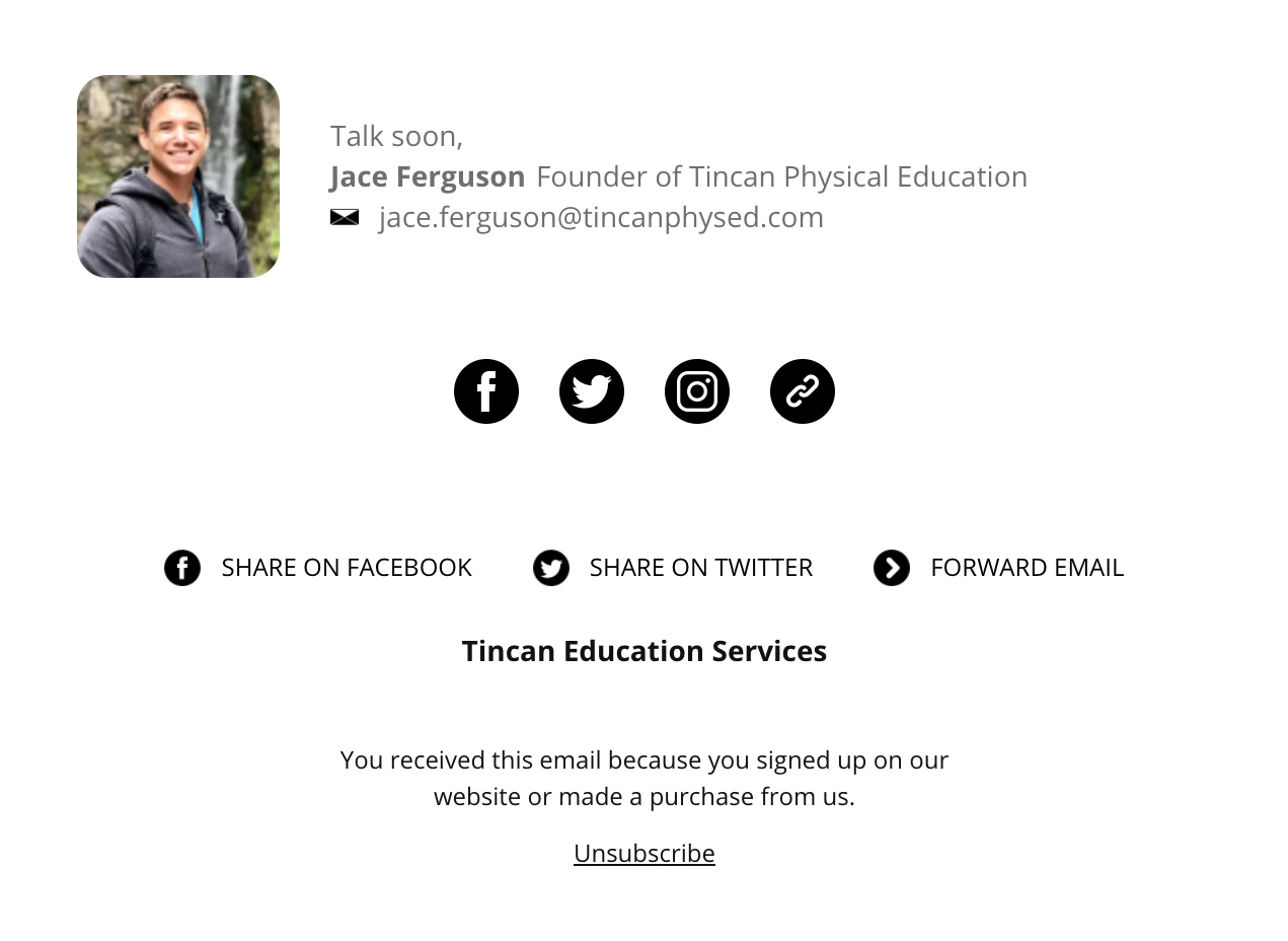
In this example from Tincan Physical Education, we can clearly see four sections separated using spacing. This makes each piece of information easy to digest. Plus, bonus points for the happy, smiley headshot!
5. Nutrition and wellness email signature
This centered email signature from Via Sana Wellness draws your eye directly to it.

6. Writer email signature
This email signature example for author Wendy Meadows makes use of dividers to section off specific elements. They’ve also included calls to action in the form of text links to direct subscribers to Wendy’s other work.

Create a professional email signature with MailerLite
1. Open or create a new email campaign and go to the Drag & Drop Editor.
2. Search for Signature in the Blocks menu.
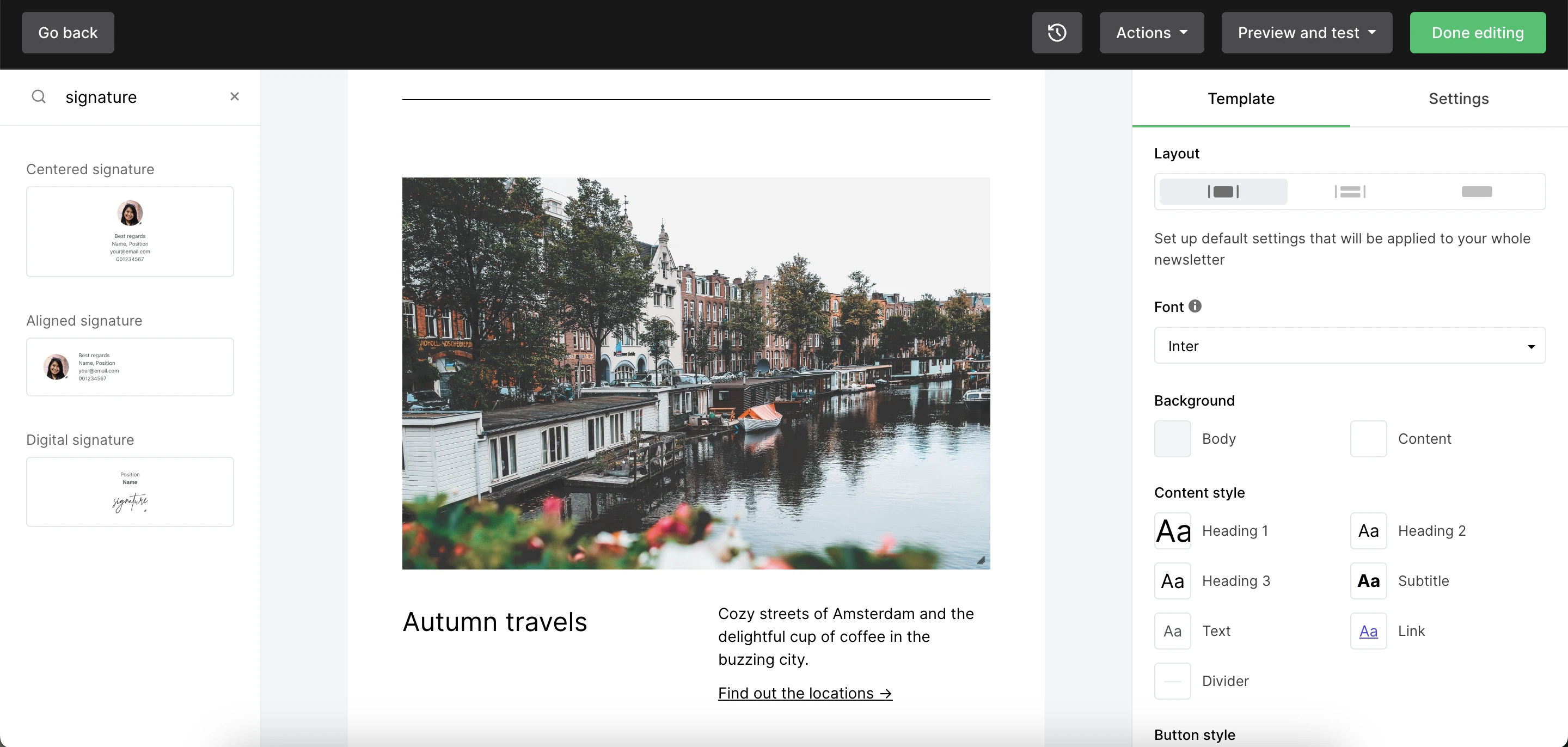
3. Select the signature template you want to use and drag it into position on your email.
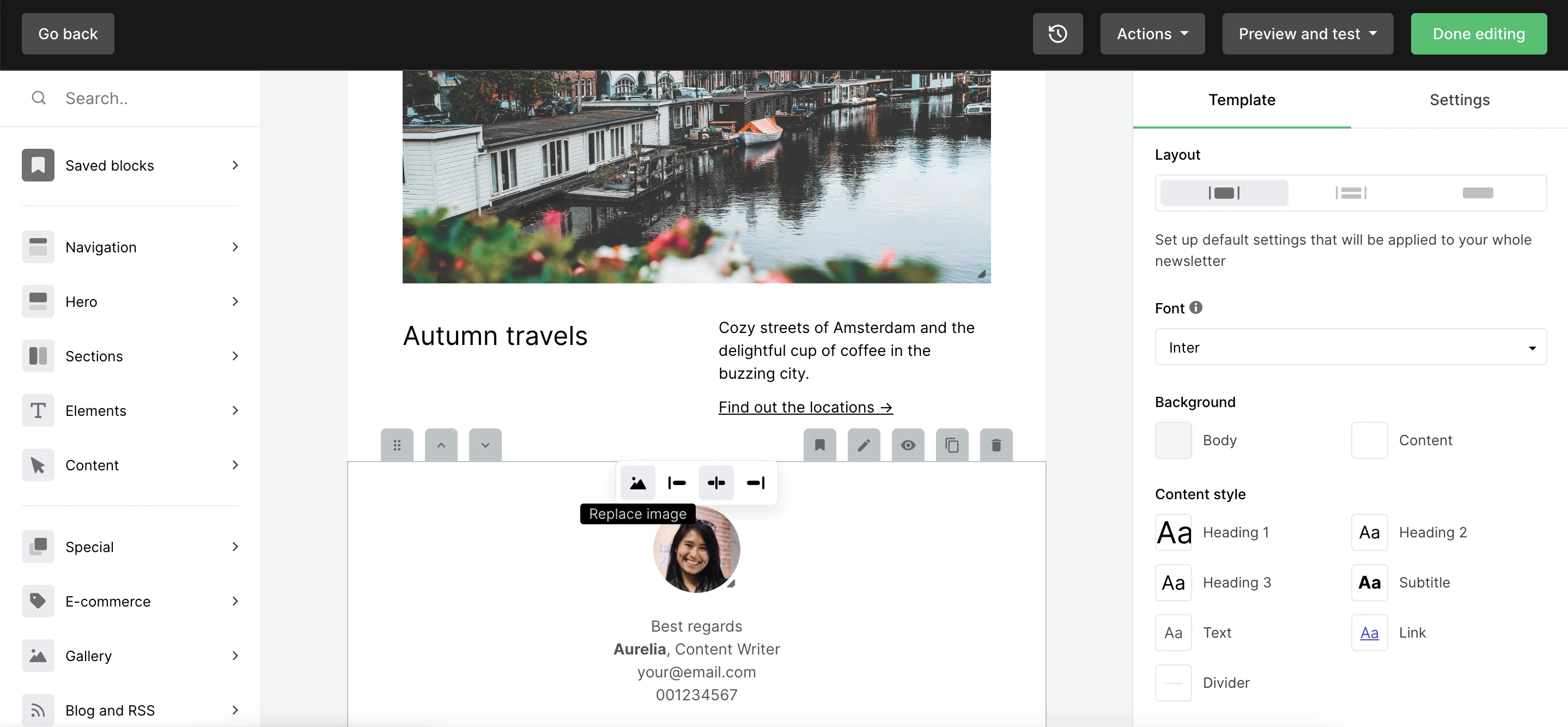
4. With inline editing, you can easily edit the signature content. Plus, simply click the image to change it.
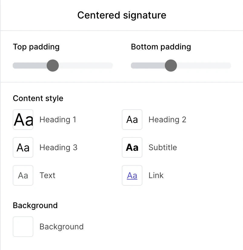
5. When you select the block, the block’s design settings will appear on the right-hand side. Here you can edit design elements including padding, font, colors and background.
And that’s all there is to it! You can save this as a custom block by hovering over signature block, clicking the Template icon, entering a name for your signature, and clicking Save.
You’ve now got your own custom email signature.
Signing off…
Every part of your email should create opportunities for subscribers to engage, convert or learn more. That includes your email signature—it’s likely the last thing they’ll see so it needs to make an impact!
If you’ve neglected your email signature so far, worry not. Now you know they are powerful marketing tools, you can get started building a brand-new, professional email signature!
For more inspiration and sign-off ideas, check out this article below.
Have you experimented with your email signature? Let us know your favorite tactics for email signatures that make a big impression!
Editor's note: This article was updated in February 2024 with more detailed best practices and updated steps for creating an awesome email signature!


