Our website builder just got a bunch of new features: Here’s the lowdown👇
 Cesar (Customer Support) and Sthefani (People & Culture)
Email and websites are a marketing match made in heaven. That’s why at MailerLite we offer a ton of website and landing page-building features alongside our email marketing toolkit.
These tools were already an easy way to build beautiful websites and pages. But we’ve been working hard on improving them and today we’re excited to introduce 11 brand-new features to help you bring your projects to life.
You can now access:
Column blocks to extend your website design possibilities
Website search to make finding content a breeze
Blog post content table and anchor links to help users navigate your most in-depth articles
Animations to engage visitors as they scroll
Product blocks to help you make sales and grow your business
Plus plenty more goodies to help you create beautiful websites. Read on to find out more!
We’ve included easy-to-follow instructions for how to use all the features mentioned in this article. MailerLite customers can easily follow along by heading to the Sites section of your dashboard and creating a new website or landing page.
Don’t have a MailerLite account? You can test out these features by signing up for a free trial. Click here to get started.
1. Access new design possibilities with column blocks

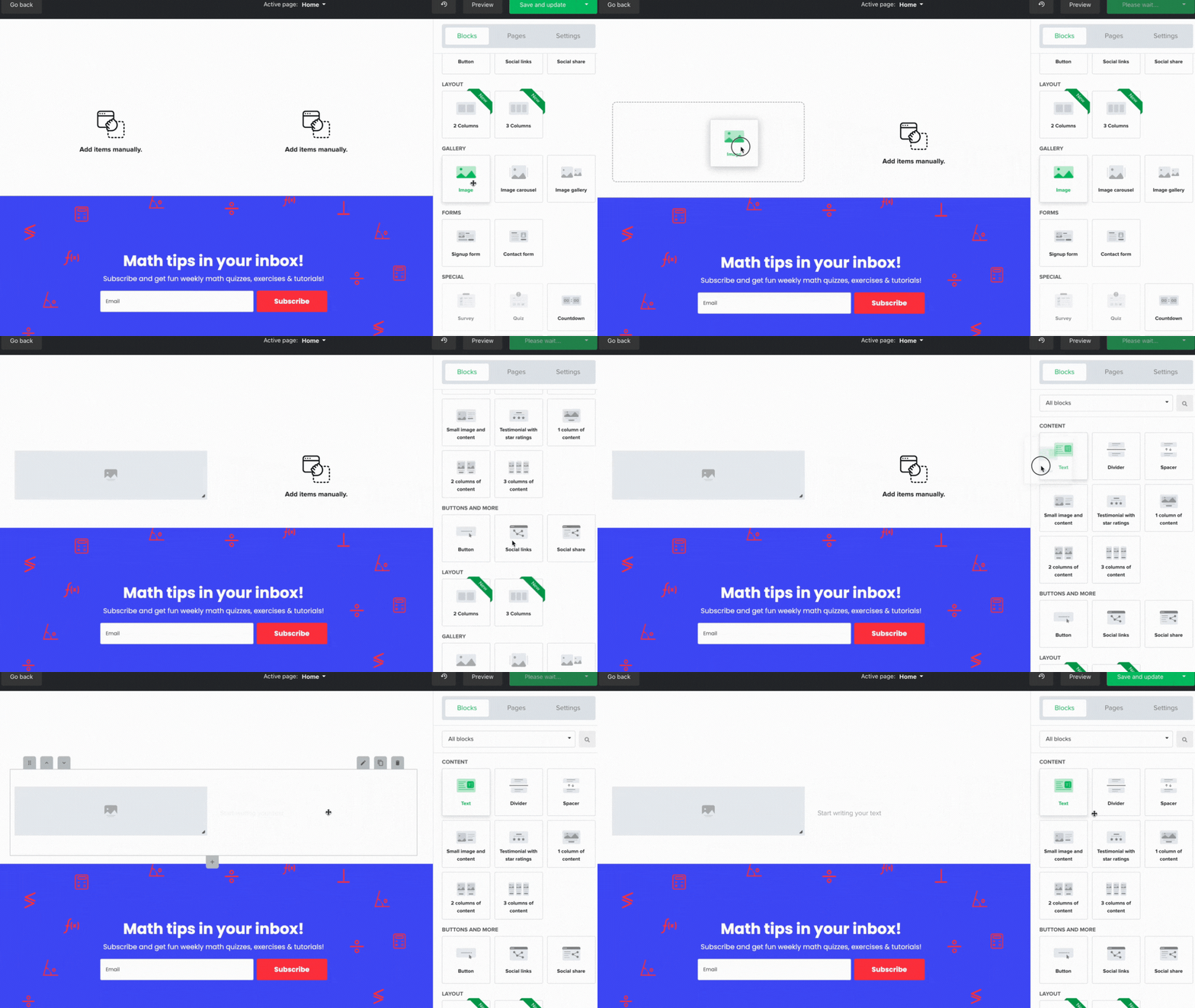
Our new column feature gives you way more flexibility when creating page layouts with our website builder. Use it to split the page canvas into two or three columns and add other content blocks to each one.
Use for: Building complex designs that look great on desktop displays and automatically stack vertically on mobile
Open the website or landing page builder
Drag the 2 columns block or the 3 columns block into position
Drag the blocks you want to use into either column
2. Make your content easy to find with website search

Make it easy for people to find content on your website with our new website header search icon. Visitors click on the icon to access the search tool, and results appear below the bar in real time as they type. Visitors can simply click on the result to head to the page they need.
Use it for: Making your content easy to find—essential for large websites with multiple pages
Click on the edit header button within the website editor
Click on Settings and toggle the Enable search function on your website to on
Hit Save
3. Improve navigation with blog post anchor links

Anchor links are a website navigation feature that lets visitors jump to predefined web page locations. We already offer anchor links in our website builder, and you can now access them in our blog post editor too. Use them to link to your page from contents, images, or button blocks.
Use it for: Allow readers to skip to the content that catches their eye or direct them to CTAs and offers
Click the + symbol in the blog editor and choose Anchor
Name the anchor to make it easy to find in the next step
Add a table of contents, image, or button block
In the block settings, open the Link drop-down menu and choose Anchor
Select the anchor you want to link to
You’ll first need to set up a blog on your MailerLite website. Follow the steps in this article to find out how to create a blog.
4. Cut to the chase with blog post content table blocks

A primary use case for blog post anchor links is the ability to add a table of contents to your post. Add a content table block to the top of your blog post so readers can skip to the section that interests them most. With this tool, even complex guides become easy to navigate.
Use for: Add to the top of your blog posts to help readers skip to the section they want to read
Add anchors above each section of your blog post
Click the + symbol in the blog editor and choose Content table
Add sections to the content table
Edit the title and then choose the relevant anchor
Edit design settings such as spacing, dividers, and whether to show content in a card
5. Start your e-commerce empire with product blocks

Promote products on a landing page or website with our e-commerce product block. The block connects to your Shopify, WooCommerce or Prestashop store and imports the image, price, and description of your chosen product. The block links to your store, where customers can complete the buying process.
Use for: Promote products from your online store on your MailerLite landing pages.
Add the Products block to your website or landing page
Choose which product to display
Edit the information where necessary
This block is only visible on accounts with connected ecommerce stores. Learn more about our e-commerce integrations for Shopify, WooCommerce and PrestaShop.
6. Reset your analytics data after testing

Testing your new website is an essential part of the design process. But metrics from this period can hurt your ability to see how your site performs with real customers. With this in mind, you can now reset the web analytics data of any form, pop-up, landing page, or website to get a more accurate view of its performance.
Use for: Reset your website data before you launch to accurately track your website KPIs
Once you finish the below steps, you won’t be able to restore your statistics.
Head to the Forms section of your dashboard
Hit the Overview button on the form you want to reset
Head to the Analytics tab, then hit the Reset analytics button
7. Give your website a professional touch with our icon library

Our new icon library allows you to add icons to your website in any place where you can add an image. You get access to a huge array of icons on almost any topic, and you can easily import them into your file manager for repeated use.
Use for: Increase readability, highlight elements, and help people understand website content at a glance
Choose the Image block or a content block that includes an image
Head to the image settings and hit Browse
Hit the arrow next to Upload image, click Iconfinder, and then search for an icon
Select the one you want to use and hit Import to add the icon to your file manager
Hit Insert to add the icon to your page
8. Answer visitor questions with the FAQ accordion block

FAQs provide crucial answers, but they can take up a lot of space on a page. Our new FAQ accordion block solves this problem by allowing you to display questions that visitors can click on to expand the block and see the answer.
Use for: Address sales objections and improve the user experience. Using structured data like FAQs can also make your site more SEO friendly, which can result in more web traffic.
Click here for more beginner SEO tips to generate traffic from Google
Drag the Accordion block to the relevant position in your page
Use the Tabs section to add and edit FAQs
Add a title, subtitle, text, and a button
Decide whether to keep the first tab open or closed and whether to show spacing between tabs
9. Bring your website to life with animations

Animations is a new design feature that adds movement to content blocks that occurs as you scroll. This helps engage website visitors and gives your site a professional look and feel. Choose from either fade, flip up or zoom in animations to add something special to your pages.
Use for: Add extra sparkle to your website and help it stand out.
For more about creating websites that shine, check out our article on web design best practices
Open the website or landing page builder and head to page settings
Click on the animations drop-down menu and choose your favored option
Click on Preview to see your chosen animations in action
10. Create spectacular image galleries without padding

We’ve updated image spacing so you can now add images without padding to your page. You can remove all white space from around the image and place it directly above or below other elements in your page builder.
Use for: Showcasing your best photos in an impressive gallery. Or split long images into several shorter images to reduce file size and improve load times.
Choose the Image block from the block library
Open the image settings
Adjust the slider so that top spacing and/or bottom spacing is set to zero
After completing the above steps, you’ll still see spacing when viewing your site in the page builder. But the white space will disappear when you view the preview or publish your page.
11. Grow your mobile app with app store buttons

Our final new landing page feature is app store buttons. These let you quickly add links to your app on the Google Play Store and iTunes App Store using icons that your readers are already familiar with.
Use for: Promoting your app and sending it to the top of the app store listings!
Drag the Applications block into position in the website builder
Open up the edit settings and add links to the relevant app stores
Configure alignment, spacing, width and background settings
Be sure to check out the MailerLite mobile apps. Use our email marketing iPhone app to manage your campaigns on the go and our iPad forms app to collect email subscribers offline.
There’s plenty more to come!
These latest releases are the website builder-related features we’ve worked on over the last few months. But we aren’t about to stop, and you’ll notice more new features over the coming year.
We’ve also recently released plenty of features related to our email marketing and forms toolkits, including forms A/B testing, an easier way to resend campaigns to new subscribers, and the ability to edit links in sent campaigns.
Keep up with all our latest updates via our what’s new page.
Build a website to test these features
Anyone with a MailerLite account can test these features within our website builder. Just head to the sites section of our dashboard and choose to build a website or a landing page. Hit the button below to get started.

