11 promotion pop-up ad examples that enhance the website experience
 Jessika, Customer Education Team Lead
Think about your last visit to an offline store. The shop was probably filled with helpful signs that directed you to products you needed while promoting various sales and offers.
Promotion pop-ups are the online equivalent of these in-store signs. They help potential customers get the most out of their website visits by sharing relevant information that helps them buy.
This article will take a closer look at how to create promotional pop-up ads in MailerLite. We’ll then explore 11 pop-up examples that will inspire you to start using them on your website.
MailerLite promotion pop-ups: What you need to know
When you click on the Promotions tab on the Forms page, you have the option of choosing from the 12 templates below.
Slider
SliderEach promotion pop-up template is meant to help you achieve specific goals.
Limited-time discount: Promote special offers that have an expiration date. The countdown timer is an excellent device to communicate urgency.
Mobile app pop-up: Drive mobile app downloads. Add links to your mobile app listing page on the App Store and Google Play.
Webinar pop-up: Promote a webinar or event. Add a link to the event invite page in the CTA button.
Product pop-up: Increase sales of a specific product by using a pop-up to promote it to website visitors.
Mystery sale pop-up: Catch your visitor’s attention by using an animated pop-up to promote a mystery sale.
Countdown pop-up: Add urgency to your pop-up with a countdown timer you can use to promote a limited-time offer.
Social pop-up: Build your audience on social channels by asking visitors to follow you on relevant platforms.
Pop-up announcement: Share news or other important information that affects your visitors, such as planned maintenance or changes to your privacy policy.
Winter promo sale: Promote your store’s ongoing sale. Just add a sales page link to the CTA button. This pop-up includes a snow falling animation and flashing numbers.
Holiday recipe idea: Direct visitors to a super relevant blog post or piece of content. Just add a link to the CTA button.
Holiday webinar invite: Holiday-themed version of our webinar invite.
Festive product promotion: Festive-themed version of our product popup.
All of MailerLite's promotion pop-up templates are customizable. You can control the design, set the behavior, and track how effectively each one converts.
Design settings
You have complete control over the design of your pop-up advertisement so you can create one that complements your website. The MailerLite drag & drop editor lets you edit the colors, text, fonts, and images.
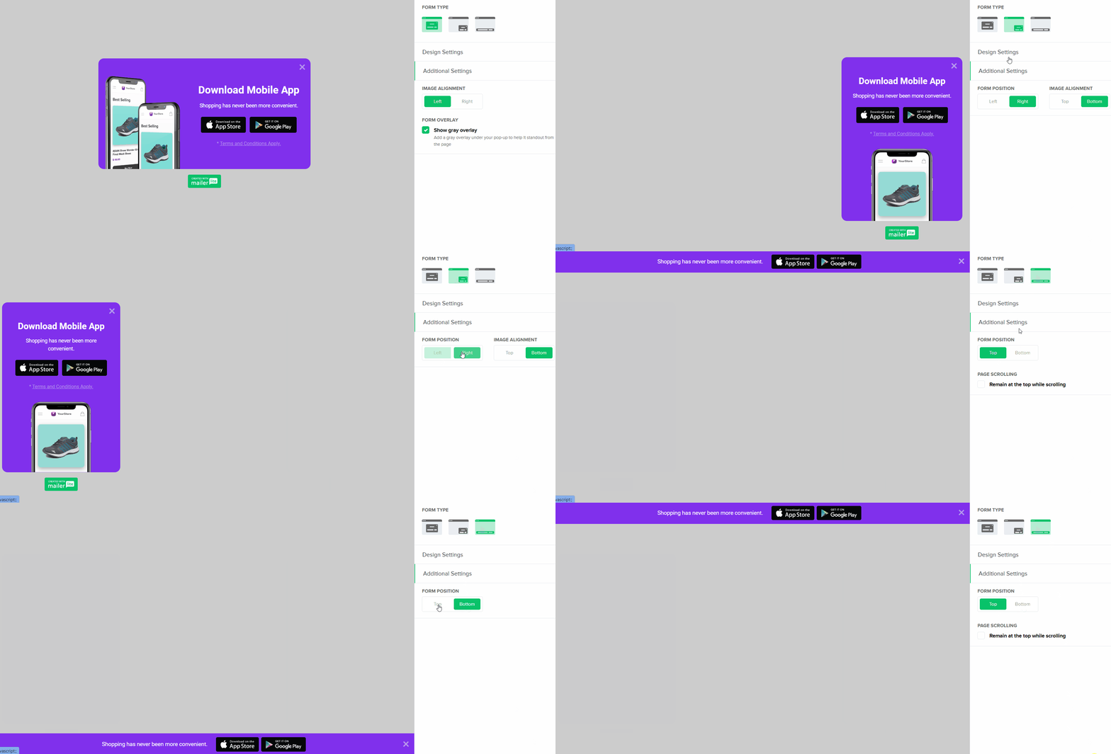
You can choose from three types of pop-ups:
1. Pop-up is the traditional pop-up that appears in the center of the screen. This is the most intrusive type of pop-up, so be sure to promote an offer that gives the reader a ton of value.
2. Bar is a pop-up form that sticks to the top or bottom of your page. It’s more subtle than a traditional pop-up and is a good way to deliver a message without stopping the reader in their tracks. Choose whether you want the bar to appear at the top or bottom of the page by clicking the Settings tab and choosing top or bottom.
3. Slidebox pop-ups slide across the screen into the corner of the page. You can choose to display the Slidebox pop-up on the left or right side of your page via the Additional Settings tab.

Behavior settings
You can control when you want to show your promotion pop-ups by changing the behavior settings. You can adjust the Trigger, Frequency, Schedule, and Visibility.
Trigger lets you choose when you want the pop-up to show. You can have the pop-up ad appear after a certain amount of time, after the page has been scrolled to a certain point, or when the visitor is just about to leave.
Frequency gives you control over when a visitor will see the same pop-up again. Use this setting so people don’t get interrupted by a pop-up every time they visit your website.
Schedule allows you to control when you want to start and end the pop-up campaign. For example, you can create a pop-up and schedule it in advance to be active from May 1 to May 30, so you don’t have to remember to activate or disable it.
Visibility lets you decide which pages or devices will show the pop-up. Use this setting to display targeted pop-up adverts that are highly relevant to specific pages.

Conversion tracking and stats
Use conversion tracking and statistics to measure how effective your promotion pop-ups are. The MailerLite dashboard highlights metrics such as the number of times the pop-up was shown and the number of conversions it generated.
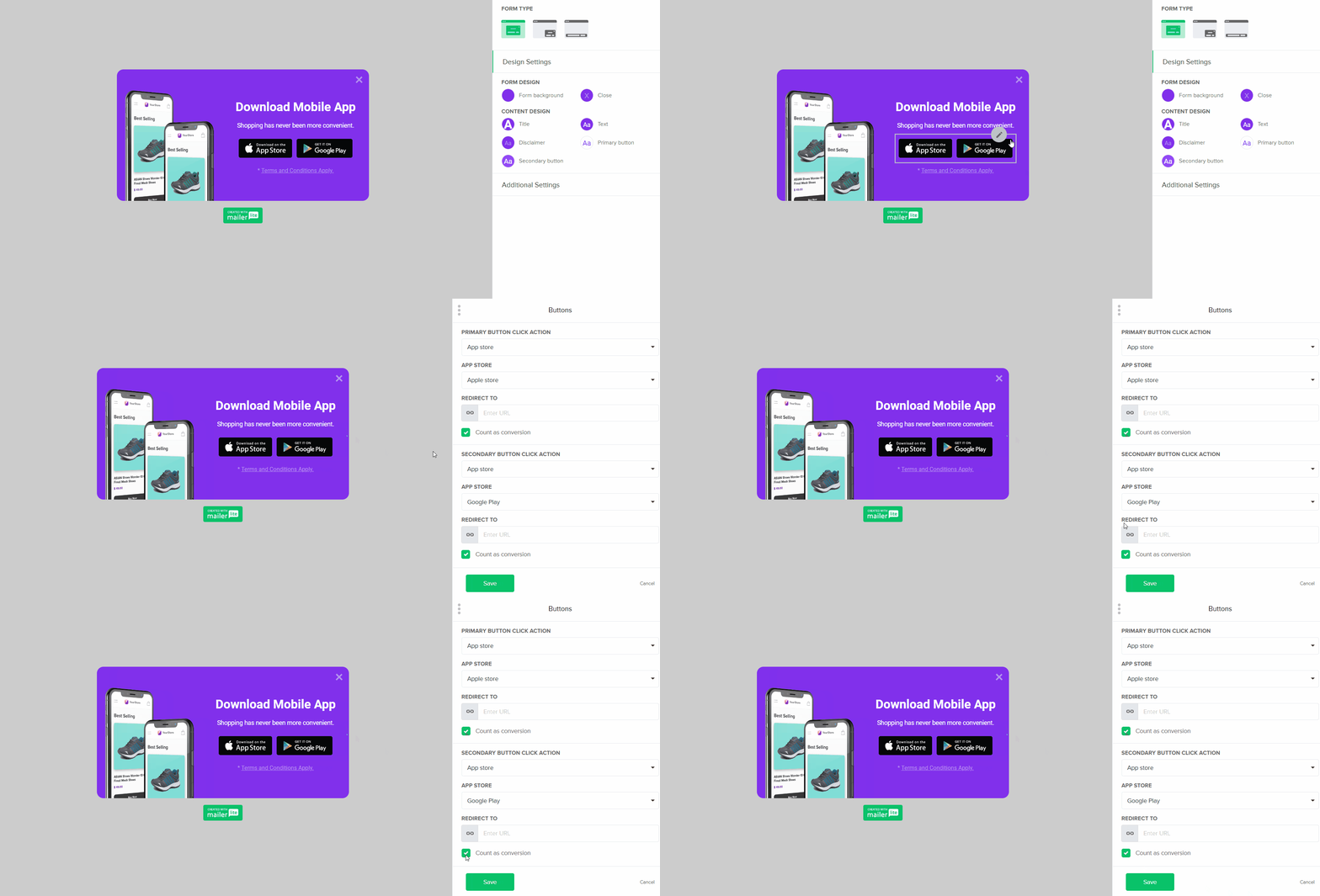
You can activate conversion tracking by adding a link to the pop-up and then clicking the Count as conversion checkbox under the button URL link (see below).

Access the performance metrics in the reporting dashboard. Here you’ll see your pop-up’s performance by day and by time period.

With visibility into your promotion pop-up campaigns, you’ll be able to experiment and test different offers and messaging to determine what works best for your audience.
11 examples of promotion pop-ups
1. Offer a coupon code
Coupon pop-ups help drive sales on your e-commerce store. Set a pop-up ad to appear when your visitor first lands on your website and raise the urgency by adding a countdown timer to highlight the code’s expiration date.

After the initial homepage pop-up, set up a recurring Bar type pop-up to display on every page that will remind the visitor that their chance to take up the offer is ending. Because the pop-up remains on the very top or very bottom of each page of your online store, people can choose to ignore it if they are not interested

Displaying a bar pop-up on product pages will also help to reduce cart abandonment.
2. Collect customer feedback
The best way to improve your customer experience is to get feedback directly from visitors.
MailerLite’s survey email block is an effective tool for asking your email subscribers questions through email, and now the new website survey pop-up template enables you to get feedback from website visitors who might not be on your email list. Even better, you get to ask people for their opinions while they are experiencing your brand.
You can set up a Survey pop-up to ask them how you can improve or send an NPS survey to gauge their satisfaction directly after they make a purchase or read a blog post.

3. Promote your best-selling product
If you run an e-commerce store, chances are you have a few popular products that customers gravitate towards. Use the Product pop-up advertisement to highlight one of your best-selling products to new visitors. Entice them with a discount for first-time buyers.

4. Encourage social engagement
Use a pop-up to promote your brand’s communication channels so you can continue to engage with website visitors once they leave your site.
The second best way to continue your engagement is through your social media channels (the best way, of course, is email marketing). Take advantage of this by using the Social pop-up advert to encourage people to visit your social pages. Make sure that when they get there, they immediately see the value of following your account.

5. Create a sense of urgency
The Countdown pop-up template is a surefire way to create urgency. Consider using a time limit to encourage people to purchase a product, book a slot in a webinar or use an expiring coupon code. Adding a countdown is a small addition that can have a big impact on your conversion and click-through rates.

6. Hold a competition
Running a competition is an excellent way to bump up engagement with your brand, collect subscribers and grow your audience. By using a promotion pop-up to advertise your competition, all website visitors have a chance to participate. While only a few entrants will win, you’ll have the opportunity to develop new relationships and make more sales in the future.

7. Get more app downloads
If you have an app related to your website content, don’t assume people will find it. Advertise your app to website visitors to get as many downloads as possible.

8. Give away free content
The best way to turn a new website visitor into an email subscriber is to give away free content. Create a giveaway and promote it using an exit-intent pop-up so that visitors who weren’t convinced straight away might be enticed by the free content before they leave.

9. Advertise a sale
Sale pop-ups are a popular use of promotion pop-ups among online retailers. Show potential customers how much they’ll save, how long they have before the sale is over, and what they’ll be getting when they click that “buy now” button.

Running sales on your e-commerce store gives you the opportunity to upsell or cross-sell to new customers. This drives sales and increases your customers’ average order value.
10. Offer a first-time purchase discount

Use a popup to provide potential customers with a discount or offer they can use when they make their first purchase.
Just create a popup that includes a coupon code and a link to your account creation page. Ask for the customer's email address when they sign up so you can continue to send them promotional content via email.
11. Offer a free shipping code when customers abandon cart

Someone starting the checkout process is a good sign they are very interested in your product. But unexpected charges such as shipping can cause people to abandon the buying process.
Stop abandoned carts by promoting a free shipping offer in an exit intent popup that shows up when someone tries to click off the page. This discount code may be all it takes to save the sale.
Why you should give promotion pop-ups a try
The simple answer: they WORK. Pop-ups are an effective way to promote your product or brand when used correctly.
Pop-ups seriously increase the visibility of the sales, products, or webpage they promote. This increases the interaction these pages get and potentially leads to more page views, revenue, and profit.
Just make sure that you don’t go overboard. Using too many popups can negatively impact the customer experience. Experiment with the frequency, page position, and volume of the pop-ups you show to get the right balance between promotion and customer experience.
For additional inspiration, including other types of pop-ups, read more about pop-ups and great examples or check out MailerLite's library of promotion pop-up templates.
*Promotion pop-ups are only available on MailerLite premium plans.
Editor's note: This article was originally published in May 2021. It has now been updated with new tips and to reflect the latest version of MailerLite.
