Unsubscribe pages: Turn goodbyes into opportunities
 Gabija, Deliverability Team Lead at MailerLite.
A newsletter subscriber hits your unsubscribe link. Oh, no! You’ve lost them forever. Not so fast! Your email unsubscribe page message has the power to make subscribers think twice about breaking up with you.
Our guess is that you’re not using your unsubscribe landing page to its full potential, if at all! As the black sheep of email marketing, unsubscribe pages are often overlooked. However, if you use them correctly they can be highly effective and save relationships.
In this article, you’ll learn how to use unsubscribe messages in ways that go beyond just confirming the email subscription exit. Plus, we share our best practices to avoid and manage your unsubscribes!
What is an unsubscribe page
An unsubscribe confirmation page is the page that a subscriber is directed to when they click the unsubscribe link in your email.
One-click unsubscribe links usually lead to a confirmation page that tells the subscriber they have been removed from the list. Alternatively, the page may ask the subscriber to confirm they did indeed want to unsubscribe or provide other options.
Email providers are making unsubscribing easier
Lately, email providers like Gmail and Yahoo have made it easier than ever for people to say goodbye to a mailing list.
With the launch of the new Gmail Subscription Center in mid-2025, users can now see how many emails they get from a company and unsubscribe with just a couple of clicks, all without ever opening a single message.
This is why many businesses are seeing a natural rise in their unsubscribe rates, nearly twice their average numbers since mid-2025.
Well, the good news is: while it might seem concerning, this change actually promotes transparency and keeps your email list healthier in the long run.
Why unsubscribes are good for your business
We know it may sound counterintuitive. Why would losing subscribers be good for your business? Well there are a couple of reasons why the unsubscription process is so important, so you’re going to want to give your unsubscribe page as much attention as you give your signup forms.
1. It’s the law
In many countries, including the United States, it's a legal requirement for email marketers to include an unsubscribe link in all their communications, as stated in the U.S. CAN-SPAM Act of 2003 and the EU General Data Protection Regulation (GDPR).
In fact, MailerLite automatically includes an unsubscribe link in all email templates. This is to protect consumers from unsolicited emails and noncompliance can lead to some scary penalties. Offering an easy unsubscribe process adheres to these laws and respects your audience's rights.
2. You can learn about your audience and improve your service
Understanding the reasons for unsubscribes helps to improve your marketing and product over time, and an unsubscribe page can serve as a valuable source of feedback.
By asking why users are unsubscribing, you can learn a lot about their experience with your content. The feedback you gather can reveal common pain points, like the email frequency is too high or the content isn't relevant. This data helps you identify patterns in what isn't working and then use those insights to improve your overall email marketing strategy.
3. You’ll have a positive brand reputation
Making the unsubscribe process easy and straightforward can contribute to a positive brand reputation. If customers find it difficult to opt out of your communications, they may develop negative associations with your brand. On the other hand, if the process is simple and respectful, they may leave with a more positive impression, increasing the chances that they'll return or recommend your brand in the future.
4. Your list will be cleaner and your email deliverability will improve
When someone unsubscribes, it's a clear signal that they are no longer a good fit for your content, and their departure helps you maintain a healthy, active list. This natural "cleansing" process ensures that your messages are primarily sent to people who want to receive them, maximizing the performance of your email campaigns.
Yep, having people unsubscribe can actually improve your email deliverability. Email service providers track how many of your emails are opened and interacted with, and low engagement can lead to your emails being classified as spam.
A high volume of spam complaints tells internet service providers (ISPs) that your emails are unwanted, which can seriously harm your sender reputation. Having people unsubscribe actually helps because it means less unengaged subscribers, and prevents an increased number of spam complaints.
An easy unsubscribe process provides a clean, safe exit, which is crucial for protecting your ability to reach inboxes in the long run.
Letting people unsubscribe ensures that your email list consists of engaged and interested users, increasing your open and click-through rates.
5. Your email marketing costs go down and you get a better ROI
Many email marketing platforms, including MailerLite, charge based on the size of your contact list. By regularly removing disengaged subscribers through unsubscribes, you can reduce your monthly costs. This boosts your return on investment (ROI), as you can allocate your resources to nurturing the relationships with your most valuable and engaged subscribers.
Note: While it's crucial to let people unsubscribe easily, your unsubscribe page is also a great chance to remind them of all the cool benefits they might miss if they choose to leave.
Unsubscribe rates by industry
Let’s check out how unsubscribe rates vary by industry and what your plan of action should be according to your sector.
MailerLite findings, based on data from over 3 million campaigns, show that subscriber behavior isn't the same for everyone.
Industries like publishing (authors, 0.21%), photo and video (0.20%), and home and garden (0.19%) tend to see higher unsubscribe rates. This might be due to their content often being project-based or highly specific.
A subscriber might sign up for a specific DIY project, a book launch, or a photography tutorial, but once their interest wanes or the project is complete, they may feel the emails are no longer relevant.
Tip: For these industries, offering options to receive less frequent emails or to select specific topics could significantly reduce unsubscribes.
On the other hand, a number of industries reported a median 0% unsubscribe rate, including non-profits, travel and transportation, and sports. These results suggest that subscribers in these fields are often highly motivated and deeply engaged.
Non-profit subscribers might feel a strong personal connection to the cause, while those in travel and sports are typically passionate about a hobby or experience.
Tip: For these groups, consistent, relevant content that reinforces their passion or commitment would be key to maintaining an engaged email list.

What makes up an effective unsubscribe page
An effective unsubscribe process begins with a clearly visible link to unsubscribe from the list or update preferences in every email. This ensures transparency and respects your audience's right to opt out at any point.
But an effective unsubscirption process doesn't end here; the unsubscribe page can offer so much more than a confirmation message. Let's dive into its key components, highlighting how a tool like MailerLite can help you build them:
A custom page for re-engagement
A custom unsubscribe page is an opportunity to re-engage your subscribers before they leave for good. By customizing the content on this page, you can include compelling messages and offers that might convince them to stay.
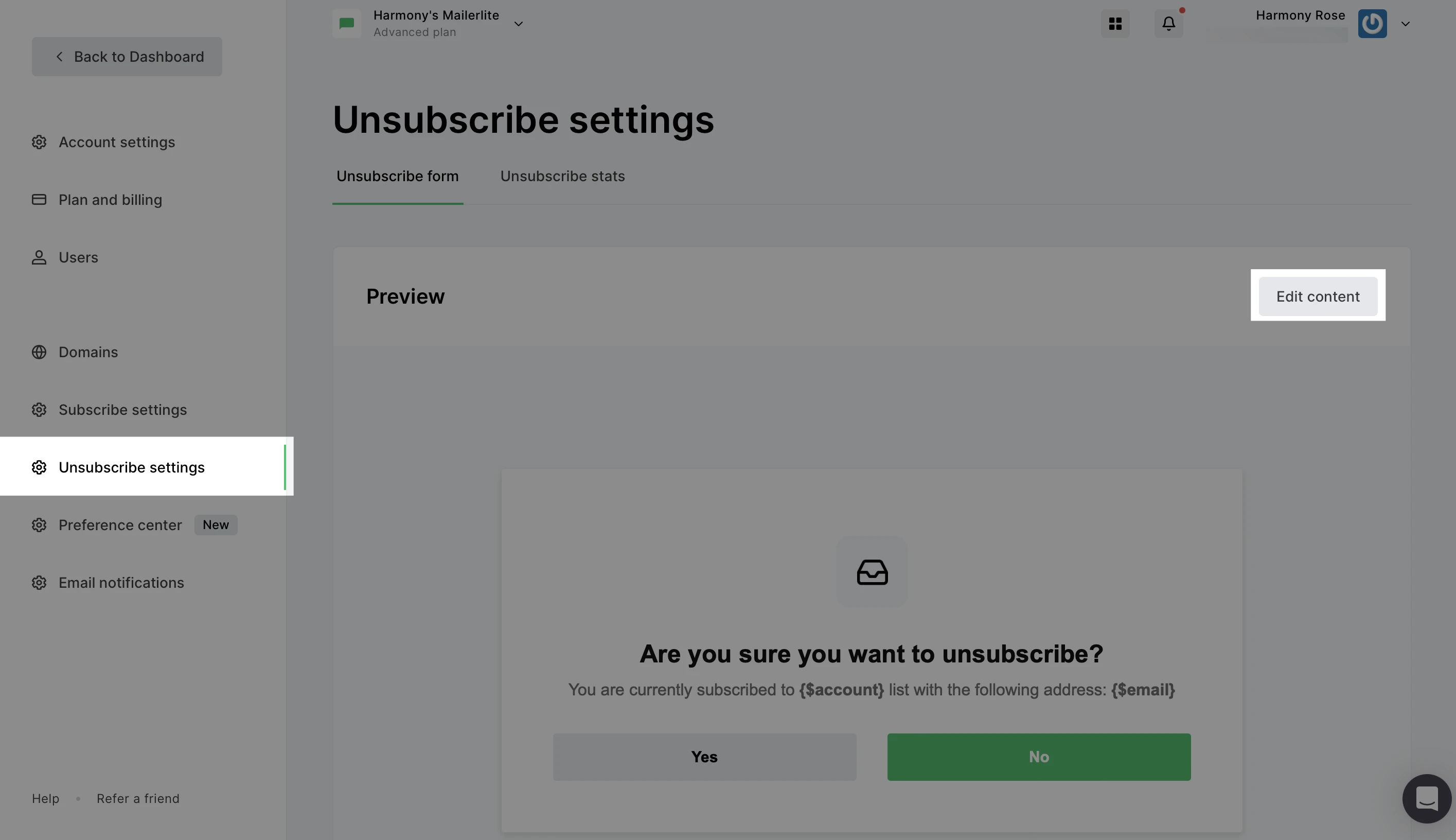
In MailerLite, you can begin editing your custom unsubscribe page by navigating to Account settings > Unsubscribe settings > and clicking the Edit content button.

Consistent design and branding
The unsubscribe page should reflect your brand identity through consistent use of logos, fonts, colors, and overall aesthetics. This enhances brand recall and ensures a cohesive user experience, even when they're leaving.
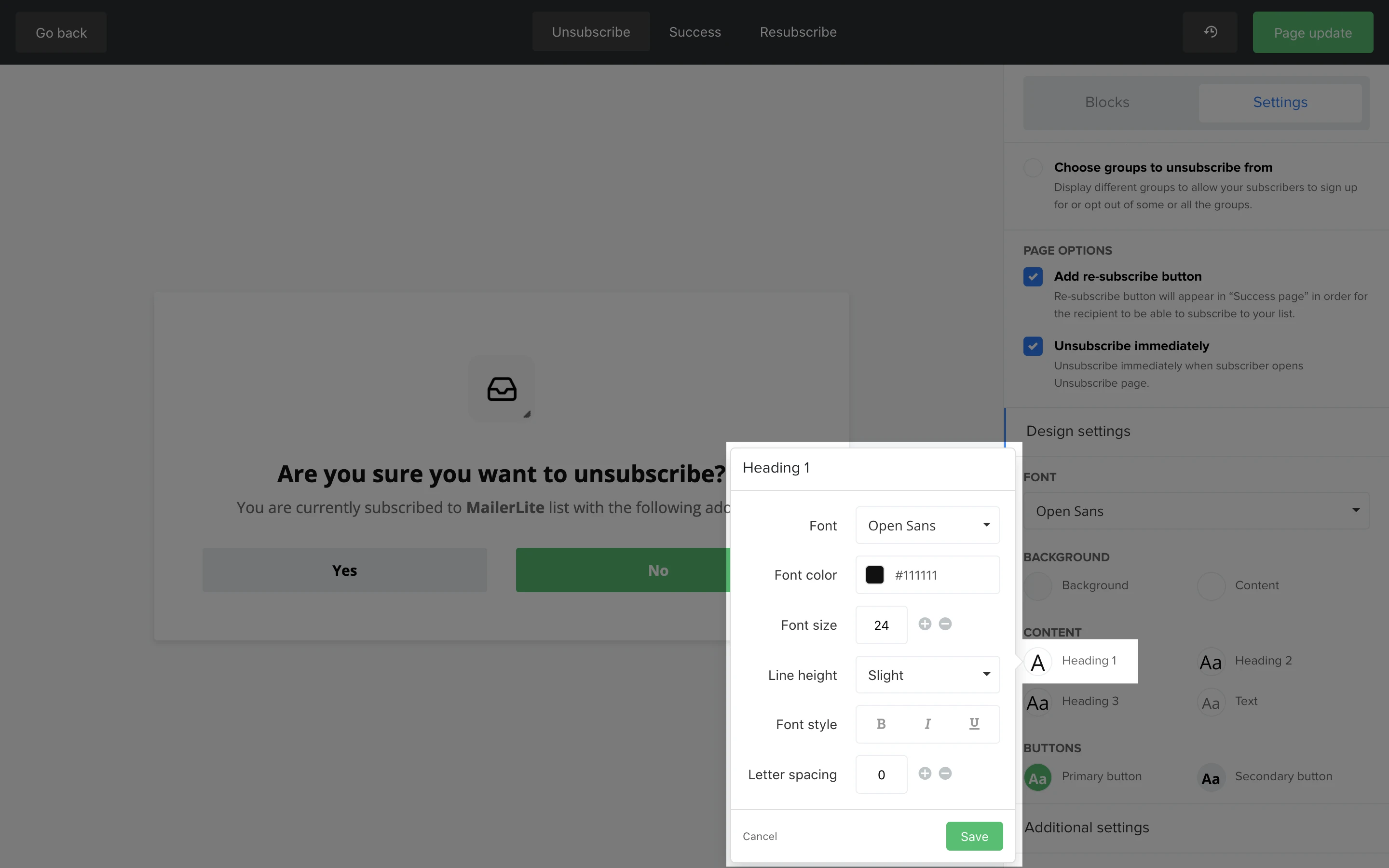
With MailerLite, you can use the Design settings to easily tailor every element of the page, including colors, fonts, sizing, and spacing, so it looks like a seamless extension of your website.

A clear and descriptive heading
The heading of your unsubscribe page needs to be clear and direct, something along the lines of "We're sorry to see you go." This communicates the intent of the page immediately, reducing confusion and frustration for the user.
An optimized unsubscribe confirmation message
An effective unsubscribe confirmation message validates the user's action and prevents potential misunderstandings.
Keep it concise and personalized, reinforcing your brand's value by referencing past useful content. Express gratitude for their time with your brand and propose alternatives for staying in touch, like social media, promoting continued engagement.
Content that encourages subscribers to stay
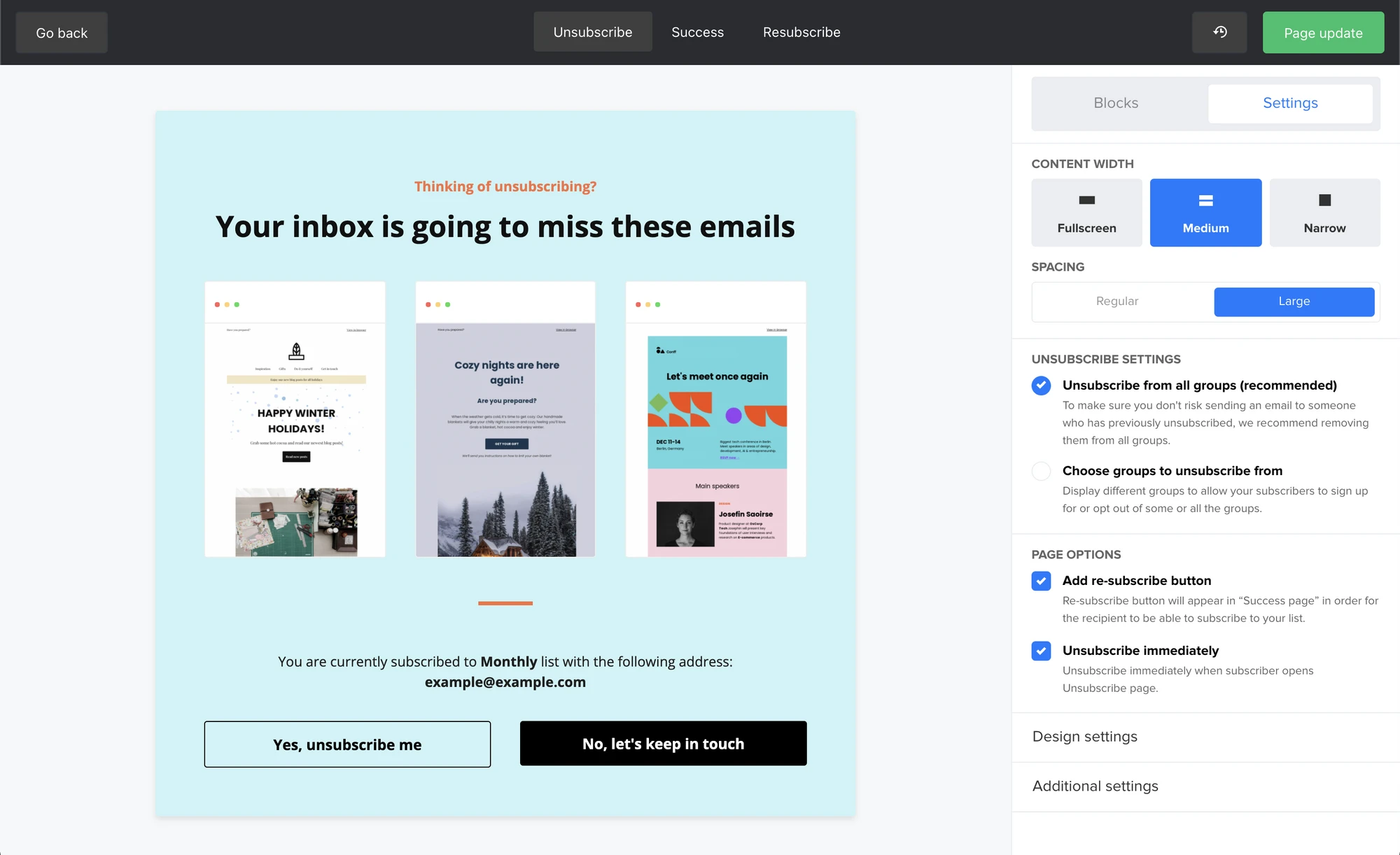
Beyond a simple message, you can add compelling content to your unsubscribe page. MailerLite’s drag-and-drop editor offers eight different content blocks that give you extra flexibility when trying to re-engage subscribers:
Image: Add visuals to make your page more engaging
Text: Add additional text to convey a personalized message
Image and content: Combine visuals and text to create a stronger appeal
Video: Include a video to deliver a more personal message or highlight a product
Newsletter archive: Take subscribers on a walk down memory lane with a preview of past newsletters, reminding them of the value you offer
Social links: Invite your unsubscribers to follow your social channels instead.
Divider: Separate content with a dividing line for a cleaner look
Spacer: Create space between content blocks to improve readability

A feedback form
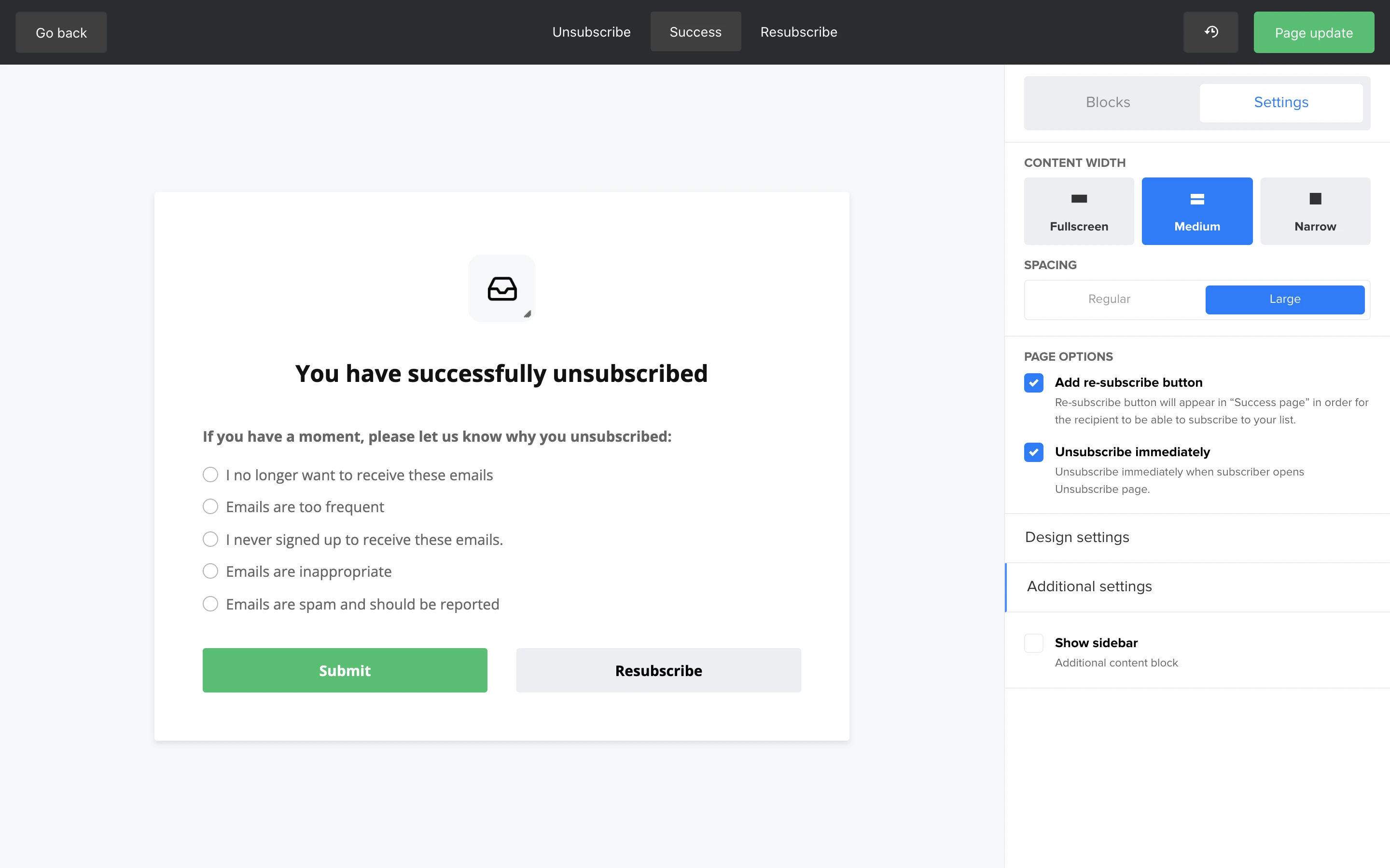
Include a simple form asking for the reason behind their decision to unsubscribe. This is a valuable source of feedback, and it gives you insights into areas for improvement. For example, your emails may not be relevant enough, or you’re sending them too frequently.
A "re-subscribe" safety net
Sometimes a subscriber clicks the unsubscribe link by accident. A simple "Wait, I didn't mean to!" button or a link to "re-subscribe" on the confirmation page can be an easy way to win back those who had a change of heart or made a mistake.
MailerLite's unsubscribe page builder by default includes a Resubscribe button that you can add to prevent these accidental unsubscribes.

Remember, an unsubscribe page isn't merely a goodbye; it's an opportunity to reconnect or make space for a graceful parting that keeps the door open for future re-engagement.
Here are some of the best unsubscribe page examples
The best unsubscribe pages are more than just a confirmation landing page. Craft a personal unsubscribe message, ask for feedback, and give your best effort to change the subscriber’s mind. If all else fails, convince them to stay in touch via social media.
Sure, unsubscribes can be disappointing, but it’s important to give people the option to leave whenever they want. Add an unsubscribe link in every email and avoid readers clicking on this link by sending relevant email content. Spot disengagement by using email surveys to stay on track with how satisfied your email list subscribers are. This way, you can act before it’s too late. Good luck!
Watch this tutorial video or head to the knowledge base to see in detail how you can create your own custom unsubscribe page.
Just Property makes the unsubscribe form part of the background, making the entire page look professional and in line with their brand identity.

USA Today bestselling author Kelsey Browning cleverly uses the unsubscribe text to motivate readers to keep in touch with her via social media.

The Hustle wins a spot here for their smart use of unsubscribe options. Not only can subscribers select which types of content they want to see, but they can also put a 2-week pause on the daily newsletter. Great for those subscribers looking for some quiet time in their inbox without completely unsubscribing!

Funny unsubscribe confirmation message examples
Interior design business coach Alycia Wicker got us laughing with her witty unsubscribe page text. It's always a good idea to add some humor to your marketing copy!

The Remote Company keeps things simple and humorous with minimal text and an eye-catching image.

Pages with unsubscribe options
We like how WordPress support and maintenance service Geek in your pocket added a personal background and gives readers the option to choose from which email lists they'd like to unsubscribe.

Helpscout makes it easy for subscribers to find what they’re interested in by breaking down their content into 8 categories they can select to hear about.

Non-profit organization, Charity: Water, provides multiple options based on email frequency and content, letting subscribers know exactly how often to expect emails from each channel.

Great unsubscribe text examples
Currys plucks at the heartstrings with emotional language and a cute doggo. Their text is clear and straight to the point but manages to include that all-important personal tone.

Morning Brew perfectly explains the benefits of being subscribed to their newsletter in just a few short sentences.

Yankee Candle injects their brand personality all throughout their unsubscribe form. Keeping the unsubscribe process simple and pleasant.

How to avoid and manage unsubscribes
Though we are all for making your unsubscribe page a nice place to land on, in an ideal world, your newsletter subscribers don’t even get there in the first place. Here are some unsubscribe page best practices to maintain a healthy unsubscribe rate.
Send valuable emails
It seems like a no-brainer, but are all your email messages really valuable for the reader? Google any email unsubscribe study and you’ll find that the number 1 reason people unsubscribe is “Too many emails.” Be picky with your email content and skip a newsletter if you’ve got nothing valuable to share. Experiment to find the perfect email frequency that works for your audience. This way, readers will keep their interest and stay away from the no-go zone.
Always add an unsubscribe link
“If I leave out the unsubscribe link, they can’t leave me!” But why would you want someone to stick around if they don’t want to? It's the decent thing to add an unsubscribe link in every single email so people can leave if they've had enough.
Why would you engage with people who don’t want to hear from you? This will hurt your wallet and your email stats, risking the chance of being marked as spam and ending up on a blocklist, which will have a negative effect on your deliverability and sender reputation.
Make it easy to unsubscribe
In the EU, readers need to be able to unsubscribe from unwanted emails with one click (called single opt-out). According to spam laws in the US, Canada, Asia and Eastern Europe, you can ask subscribers to confirm before they make it final (double opt-out).
We’re in favor of making the unsubscribe process as easy as possible for the reader to unsubscribe, but sometimes readers accidentally hit the unsubscribe button. So if your audience is outside the EU, the decision is up to you! Just remember, whatever you do, don’t make subscribers have to log in to unsubscribe.
Ask for feedback
A quick way to see whether people like your email content is by inserting a satisfaction survey into your newsletter. In most emails, you’ll see a range of 2-5 smiley faces that readers can click to express their satisfaction. Survey implementation is easy and the results are super useful! You can spot trends and see what email content is beloved (or not) among your readers.
Provide multiple options
Just because your subscribers need some space doesn’t necessarily mean they want to break up. Instead of just offering an "unsubscribe from all" option, provide subscribers with personalized choices to manage their preferences. This could involve reducing the frequency of the emails they receive, perhaps moving from a daily digest to a weekly newsletter.
You can also offer the option to choose the specific types of content they’re interested in or opt in to a different email list. These customizations will better align with subscriber needs and interests, potentially preventing a full unsubscription and enhancing their overall experience at the same time!
Use your emotional intelligence
An unsubscribe is a kind of breakup, and your response should reflect a certain level of emotional intelligence. It's about showing empathy and understanding, not just a cold, automated message. A simple, "We're sad to see you go, but we understand," is far more effective than a lengthy explanation.
Your tone should be respectful and final, acknowledging their decision without making them feel bad about it. This reinforces a positive brand image and leaves a good lasting impression.
Leverage feedback for deeper insights
The moment a subscriber leaves is a powerful opportunity for genuine, unprompted feedback. Go beyond a simple checkbox form to capture rich, qualitative data. Instead of a list of predefined reasons, consider a more conversational or open-ended question for a thoughtful response.
Ensure this feedback is shared with your content and marketing teams, creating a powerful loop that leads to improvements to your future email strategies.
Tip: Some people have slippery fingers. Add a re-subscribe button to your unsubscribe page for people who clicked the unsubscribe button by mistake. Especially if you have subscribers in the EU!
Create your first campaign in minutes!
Sign up for MailerLite and experience cutting-edge email marketing features built for your success, including a drag & drop unsubscribe page editor.
It doesn’t have to be goodbye
The chances are that if a subscriber hits unsubscribe in your email, they’ll follow through with that intent—but the chances are even higher if you give them no other options! A carefully thought out unsubscribe page is an easy way to sway those odds in your favor.
And even if they do unsubscribe, you can redirect them to other channels that they might prefer. Including this as a part of your email marketing strategy can help to keep the relationship alive and even rekindle the love at a later stage!
What does your unsubscribe page look like, does it add to the subscriber experience?

