8 simple steps to build a brand identity that turns heads
 Dino, Site reliability engineer
The best brand identities stand out and inspire. The red of a Coca-Cola can on a shelf, the need to run after watching a Nike ad, or the creative spark you feel when switching on an Apple device.
You may think you need to hire an expensive branding expert to create an impactful identity. But that’s simply not the case. Even a small brand, creator, or entrepreneur can build a memorable and cohesive brand style.
Follow the steps in this guide to define what your brand stands for and how you want to present it. Plus, we’ll recommend plenty of tools that will help.
What is a brand identity?
A brand identity is the collection of visual and non-visual elements that represent a company and differentiate it from competitors. It includes visual, verbal, and tonal brand elements that consistently reflect the brand’s personality, values, and message.
Visual: Logo, colors, typography, images, and other design elements
Verbal: Brand name, slogan, tone of voice, and messaging guidelines
Emotional: How you want people to feel when they interact with your brand
The business’s identity presents itself across all marketing, communication, and customer interaction channels. A strong brand identity makes you more recognizable and helps you connect with your audience, which can boost sales and customer loyalty.
If your company is already established, you probably have some elements of a brand style in place. Being more intentional about your style will help you use what you’ve already built to better define your brand.
As you craft your brand identity, document it in your brand identity guidelines. Include the various parts of your brand, and instructions on how to use them, and then refer back to this whenever you need to.
Use your brand identity in MailerLite
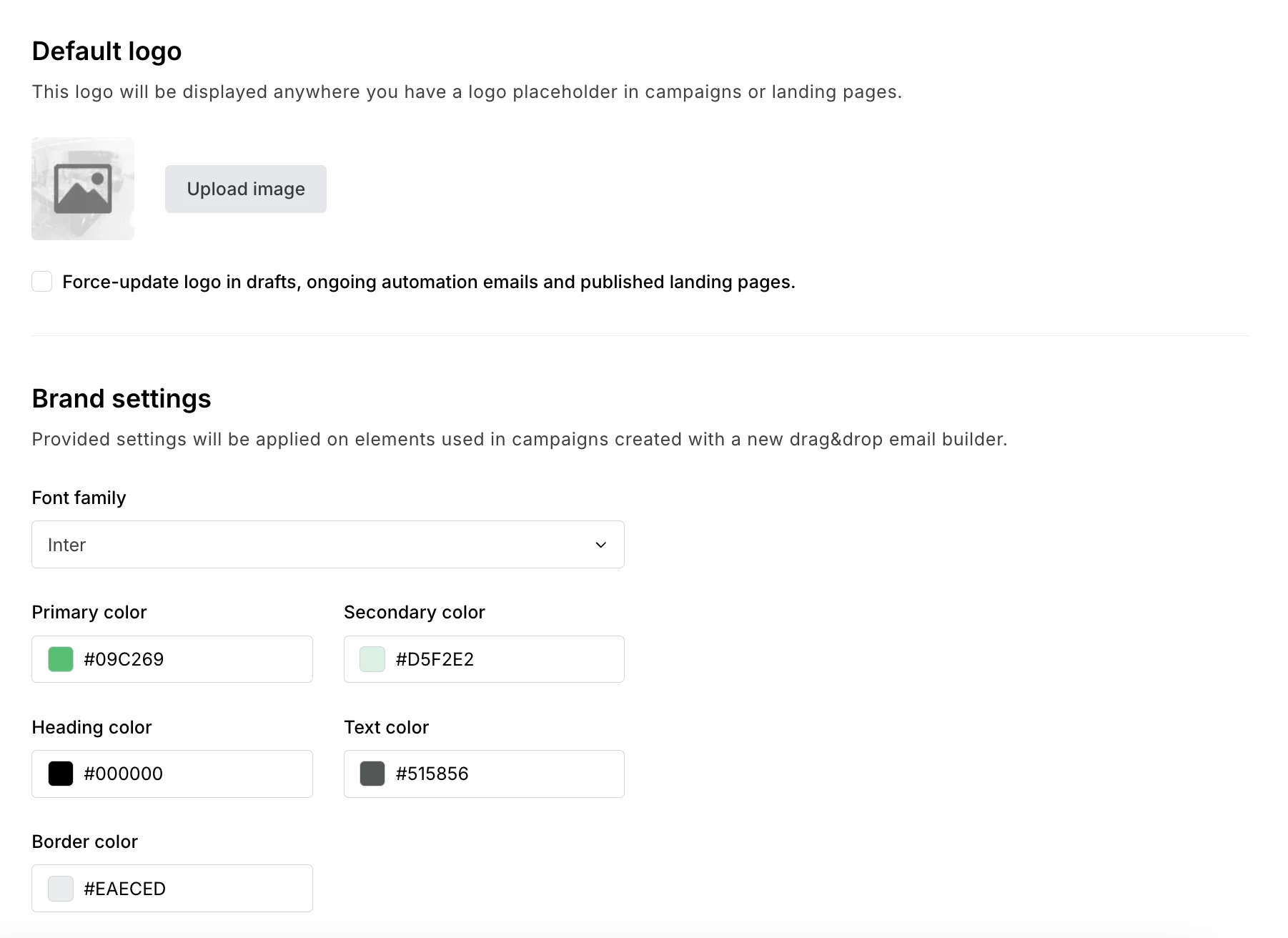
When creating email templates, you can save time and maintain consistency by setting your brand style in your account’s default settings. This allows you to effortlessly ensure that all your email marketing reflects your brand identity.
Just head to Account settings > Default settings and you’ll be able to add your logo, colors, and fonts. These styles will then be automatically reflected whenever you create a new email template in the Drag & drop editor.
Send emails that make your brand pop
With built-in brand styles, an intuitive editor, customizable templates, and reusable blocks, MailerLite gives you everything you need to design standout emails that showcase your brand. Try it free for 14 days!
8 actionable steps to create your brand identity
Here are 8 steps that will help you create a more memorable brand identity that connects with your audience and generates new customers.
1. Clarify who your audience is
Before diving into colors, fonts, or logos you need to understand your target audience and what your brand means to them. This will guide your later brand style choices, so spend some time getting this right.
Start by defining your target audience in detail. Think about specific characteristics, challenges, and aspirations. Being more specific will help you create a style that better speaks to your exact customer and creates a stronger emotional connection.
Look at data on your website, social, or email analytics platforms to get these insights. You could also send an email survey or set up customer calls to discover more about your audience.
Once you have this information, it’s easier to create brand positioning that will appeal to your audience.
2. Think about what your brand means
Once you’ve defined your audience, consider your brand's purpose, why it exists, and the change you want to create in the world. This purpose should feel authentic to your business and resonate with your target audience.
Nike is a great brand example. The company’s purpose isn't just to sell athletic wear; it's to inspire and enable athletic achievement for everyone. The brand’s messaging and style are built around this goal.
Also, think about how you want to make your audience feel. This is known as your brand’s emotional identity. A fitness brand might want to evoke feelings of empowerment and confidence, while a meditation app might aim for calm and clarity.
For the former, bold colors, motivating messaging and images of intense activity are perfect. But the same style would likely put people off using the latter tool.
3. Design your logo and define its use
Your logo can help people recognize your brand faster. It’s an important part of your visual branding because you can use it almost anywhere.
There are plenty of tools that will help you generate a logo design including Canva and FreeLogoDesign. Add details about your brand and the tools will generate ideas you can use.

For a more professional option, hire a freelance graphic designer to create a logo for you. This can be well worth it since you’ll use your logo everywhere and you can use it for years. Just be sure to check the logos the designer you choose has previously created to see if their style resonates.
What makes a good logo?
There are several keys to a good logo. First is that it should be recognizable and unique so people instantly know it's yours.
Consider adding elements that give the customer a clue about what your brand is. For example, Instagram’s logo features a camera lens, while Burger King’s has a burger. Even if people have never heard of these brands, they can guess what they do.
Create several versions of your logo so you have flexibility in how you use it. Typically this means having a horizontal logo and a square logo, as well as versions with different colors that will work on light and dark backgrounds.
Once you’ve got your logo, save it in several file formats such as PNG and SVG, including versions with a transparent background. It will then be super easy to upload the logo to wherever you want to use it.
4. Choose your brand color palette
A brand color palette is a set of complementary colors you use in your branding. Creating a successful brand color palette does 2 things:
Creates a cohesive and recognizable look. The red of a Coca-Cola can stands out on the shelf and leaves a lasting impression
Evokes certain emotions. Gucci’s color palette of gold, green and red are all colors associated with wealth
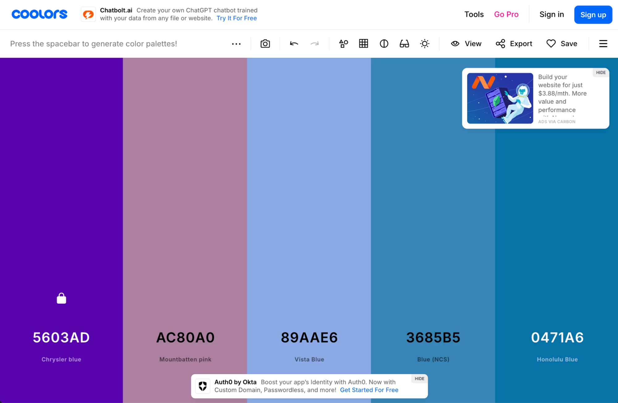
While previously you’d have had to study color theory to get a palette that works, now you can do it with the click of a button using a tool like Coolors.
The tool generates palettes in seconds and you can keep going until you find one that works. You can even save colors you like and then build the palette around that.
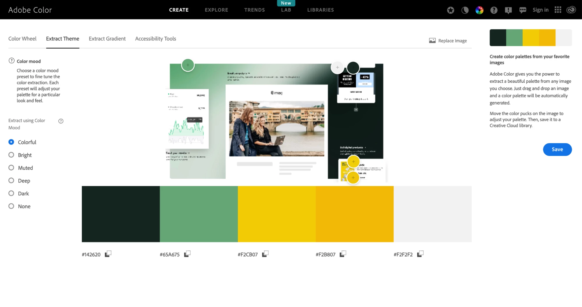
Another useful tool is Adobe Color. It has several features including one that will extract colors from an image and let you save them as a palette. See how it works below.
When choosing your palette, select colors that reflect your brand’s personality and resonate with your target audience.
Colors can mean many things. Blue signifies trust and openness, which is why it’s used by many banks, while red stands for passion and excitement, which is why it works for Coca-Cola and Netflix.
Choosing a tool that resonates with your brand personality means thinking about the emotions colors evoke and choosing ones that fit.
Check out the graphic below to see the main associations of common colors.

Consider industry expectations when choosing a color. Going against the competition can differentiate your brand and make you stand out. But in some industries, like banking or cybersecurity, choosing colors that help you fit in and appear like a safe choice can be a better brand strategy.
Once you’ve defined your palette, think about how you’ll use each color. For example, you’ll likely use specific ones for backgrounds, text, logos, and accents. Mark this down in your style guide so you stay consistent.
5. Decide which fonts you’ll use
The fonts you use are key elements of your brand’s visual identity. Like with colors, using fonts consistently across communication and marketing materials will help make your brand more recognizable.
Fonts can help create associations with different emotions, so choose wisely. Think about how you want your brand to come across and choose suitable styles. A tool like Fontjoy can help you pick typeface pairings that complement each other.
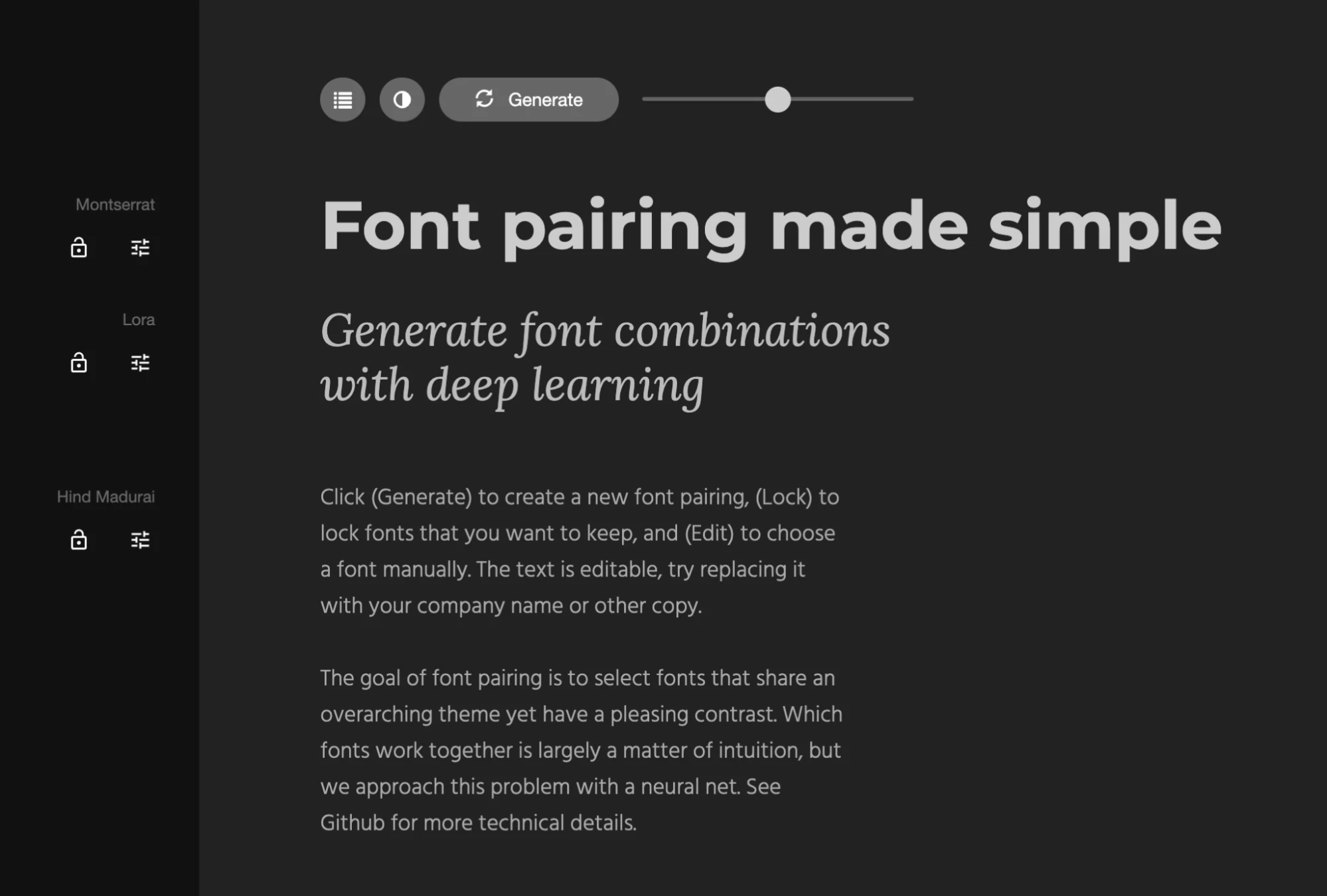
Also, specify the weight and the size of the font you’ll use. You can then create rules around when you will use each font. For example, when sending emails, choose which fonts to use for your titles, headings and body text.

You could hire a designer to create a font that is unique to your brand, but many platforms you’ll use for website building, digital marketing, and design won’t allow you to add custom fonts.
With this in mind, either choose widely available fonts or select backups you can use when your main ones aren’t available. This ensures your brand image stays consistent on every platform you use.
6. Create imagery guidelines
Your brand imagery is the photos, illustrations, or graphics you use in your marketing and communication.
An easy-to-understand example is the MailerLite website. We use images of our people to make our brand messaging feel more personal and community-focused.
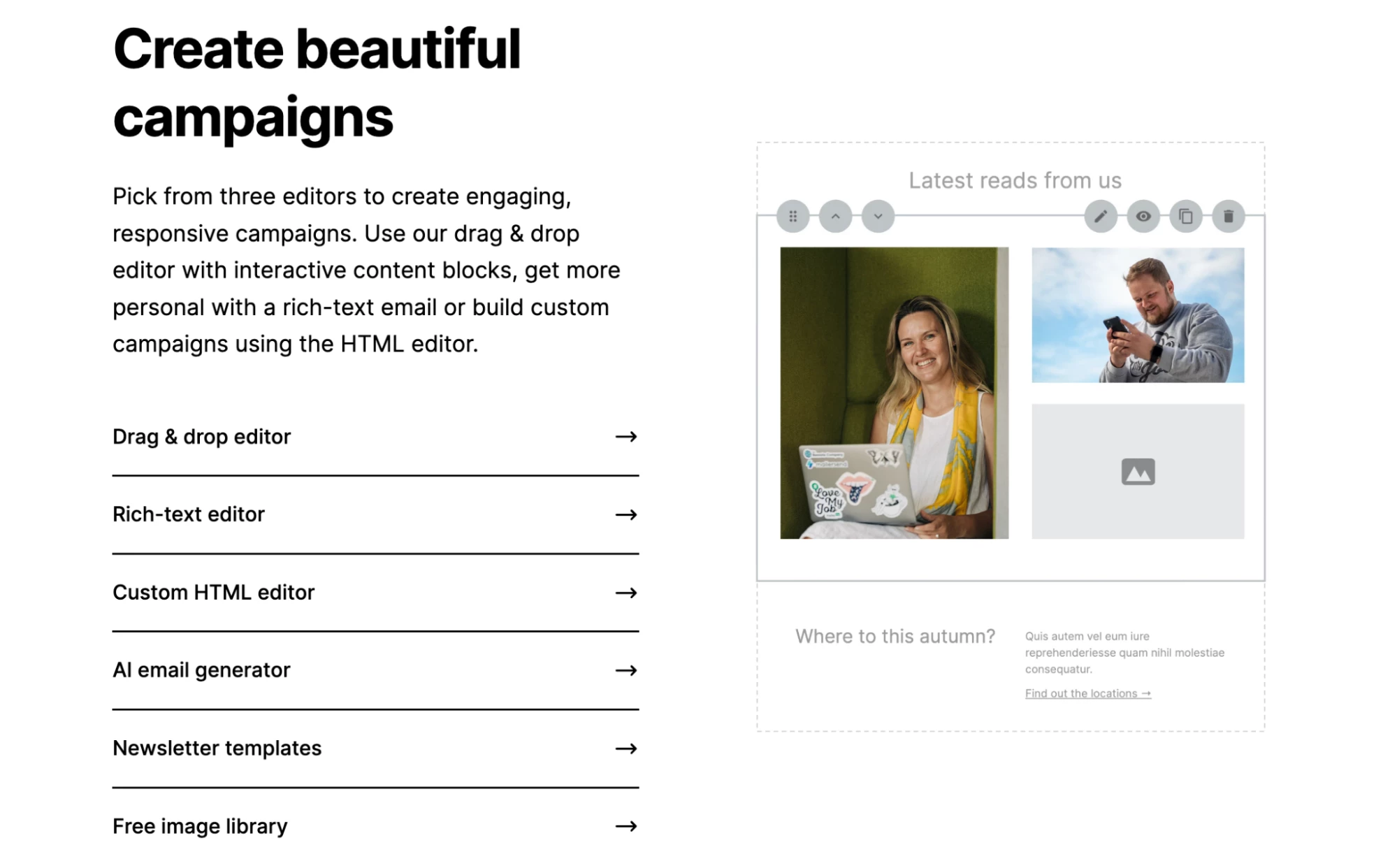
We also use minimalist graphics that focus on clarity, whitespace and cleanliness. This helps us prioritize clarity in our communications.
One way to pick designs that will resonate with your customers is to use images of people like your audience in their dream setting. This could be a family holiday provider showing images of families smiling on the beach, or a gym chain showing fit people working out.
7. Write your company name and tagline
Your brand name is often the first brand element people will discover about your business. It’s challenging to change your name once established, so if you already have a name, skip this section.
Your name can directly relate to your business. MailerLite is an example of this: it’s clear from our name that we’re an email marketing tool, which helps people understand our brand. But it would be hard for us to expand into other services without a rebranding.
The opposite of this is a more generic name like Amazon. The name worked when the company started as a bookstore, and it still works now that the company sells pretty much everything.
If you're struggling with ideas, use tools like Namelix and Shopify’s Business Name Generator to brainstorm ideas and create a great brand name. Once you have a shortlist, use Namecheck to check domain and social media handle availability.
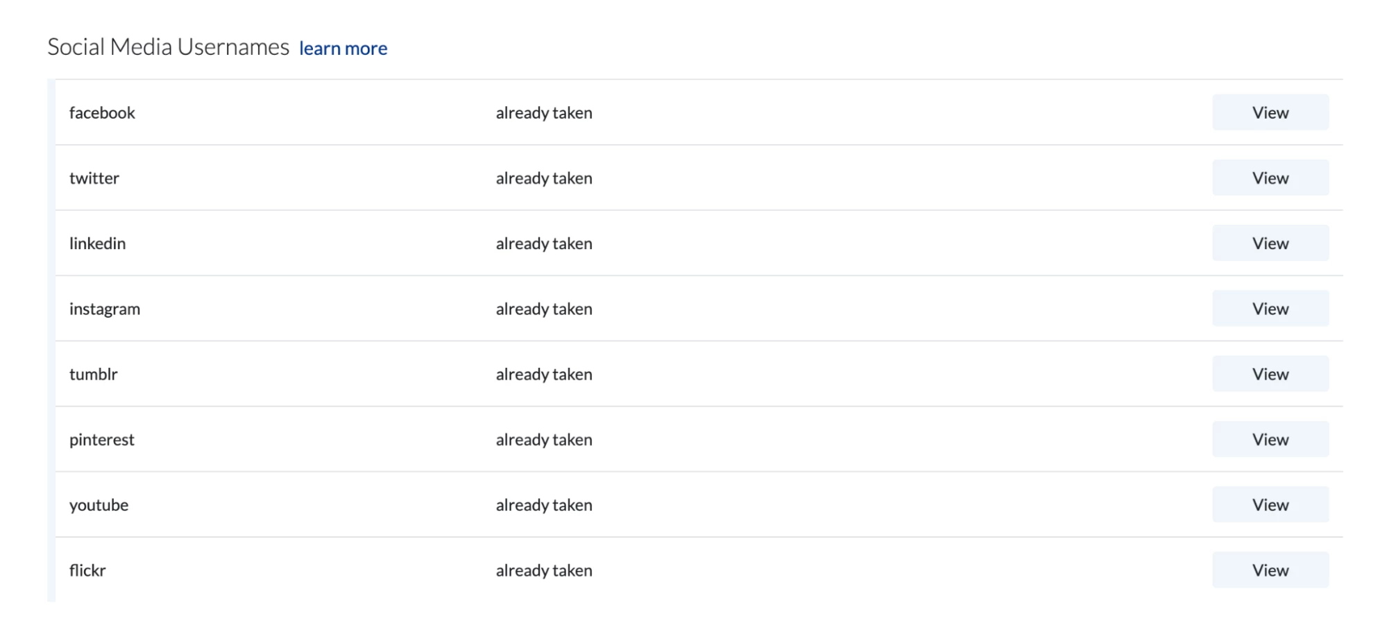
A tagline captures your brand’s essence in a few words. AI tools like ChatGPT can help generate ideas, but the best taglines come from understanding your audience and their needs. Test different options with your audience using social media polls or email surveys to find the one that resonates most.
8. Define your tone of voice
Your brand voice is how you express your personality through words. It needs to remain consistent across all communication channels.
Famous brands with distinctive tones of voice include Dollar Shave Club, which uses a casual, humorous tone, and Dove, which uses an uplifting and empowering one.
Many small businesses have distinctive tones of voice too. MailerLite customer Fridja uses a friendly and welcoming tone in all its emails since the brand’s goal is to develop relationships with customers. Meanwhile, BuildCamp uses a friendly yet informative tone that is suitable for an education company.
To create a tone of voice, think about the audience and emotional identity you created in step one. You can then define a voice that is likely to resonate with these people. Consider writing examples in the style you want to use or gathering examples from your previous content.
9. Develop messaging guidelines
Your messaging framework serves as the foundation for all your brand communications. It ensures that all your communication, from ads to blog posts and customer support communication, effectively portrays your unique identity.
Creating messaging guidelines could be an article in itself. To keep things simple, write one sentence that defines what you want your brand to achieve and then support this with 3 to 4 key points that back up your main message.
Once you’ve done this, ensure that all the content you produce considers these points to some extent.
Brand style and identity guide examples to inspire your own
Brand style guides can be pretty large—some of the documents below are over 100 pages long! You probably won’t create a similar resource. But you can still look at the types of things these documents include to inspire your own guide.
Coca-Cola
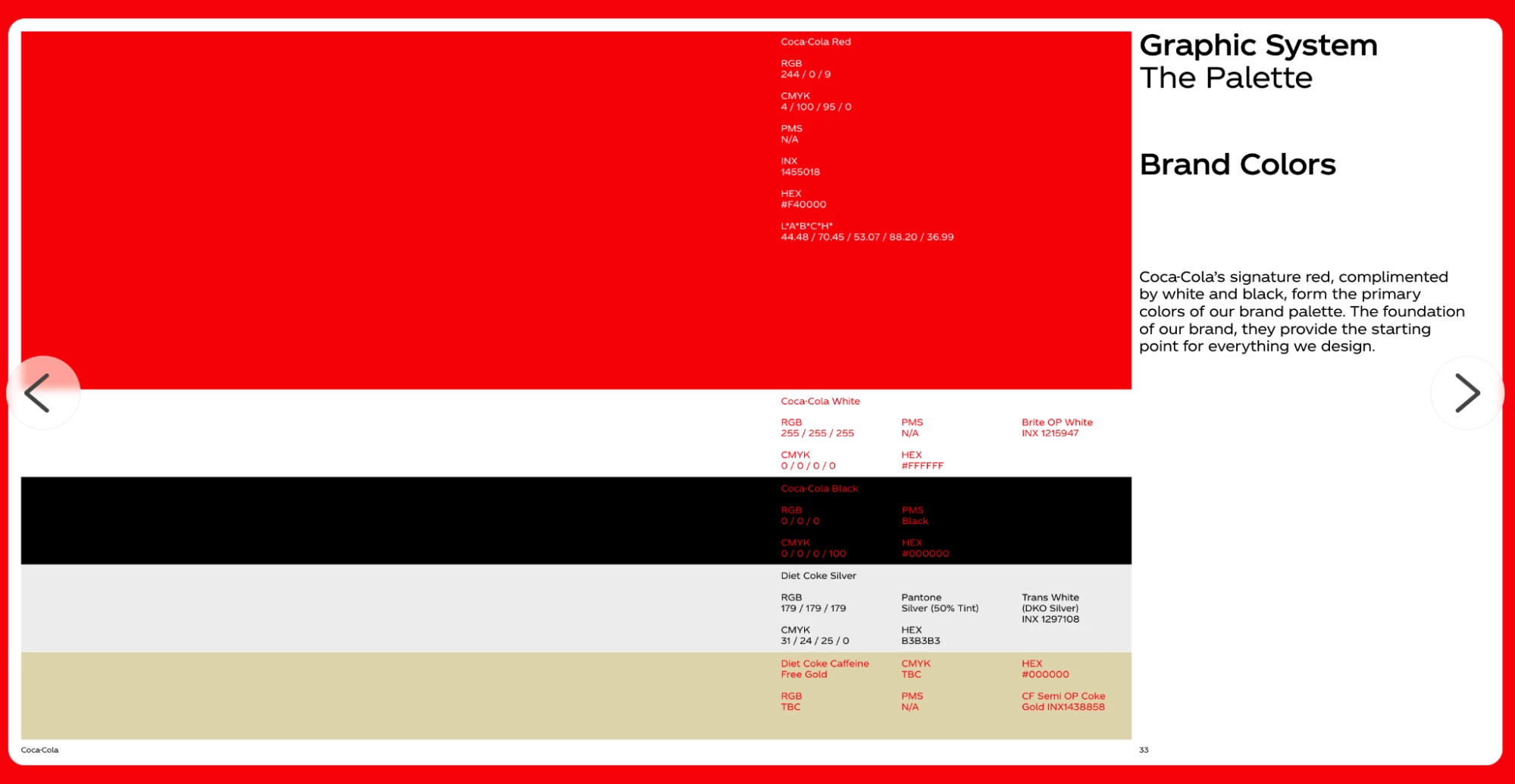
Few brands are as recognizable as Coca-Cola. This brand style document explains to designers exactly how they should use the logo, fonts, colors, and icons to effectively put across the brand’s visual identity. It also highlights things they shouldn’t do, just in case.
Zoom
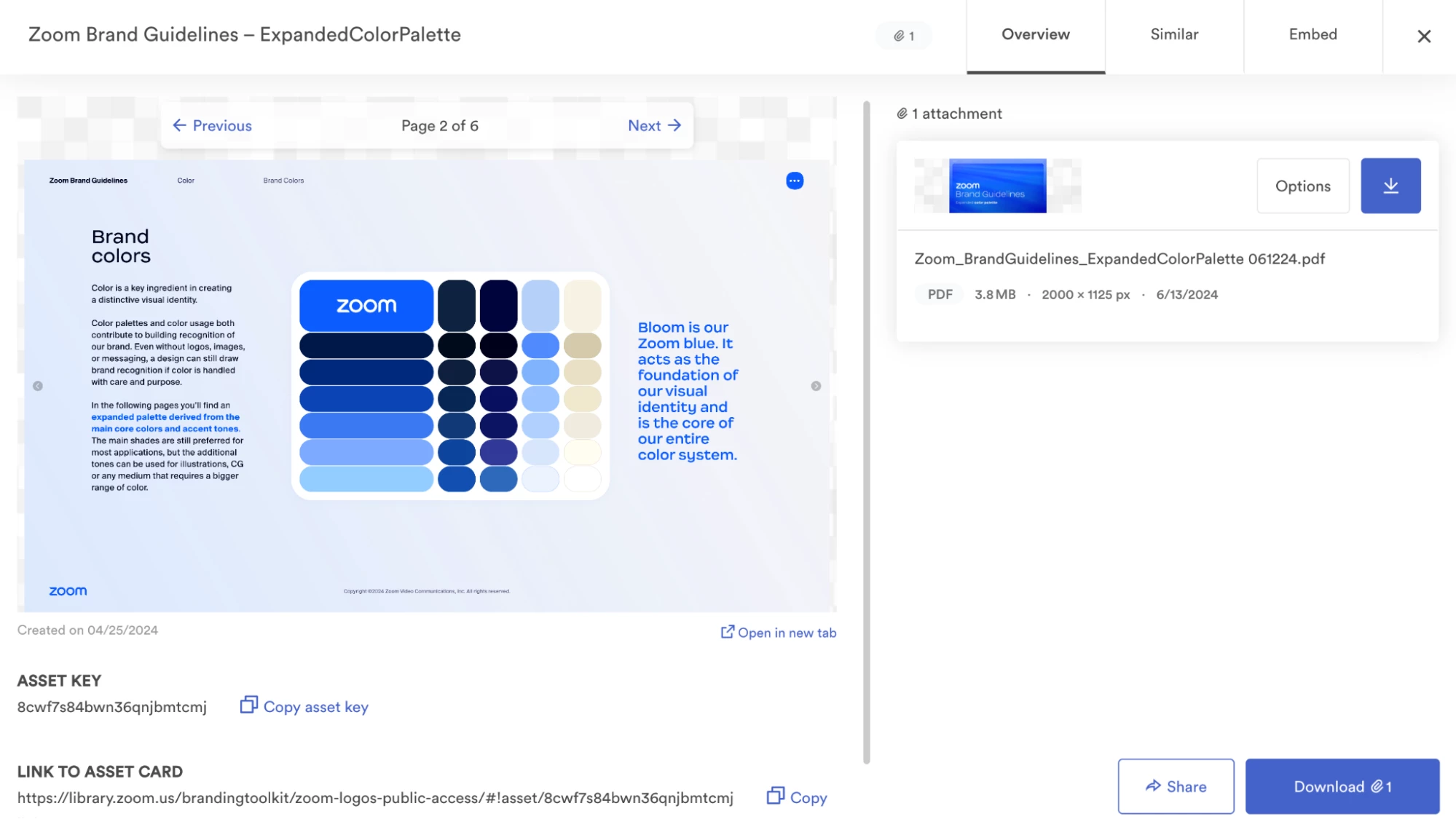
Zoom’s brand style guide goes in-depth into all aspects of its verbal and visual identity. It explains exactly how people can use the logo, colors, and more. The brand has even created a style guide for its physical spaces, which explains how its offices should be decorated.
Government of South Australia
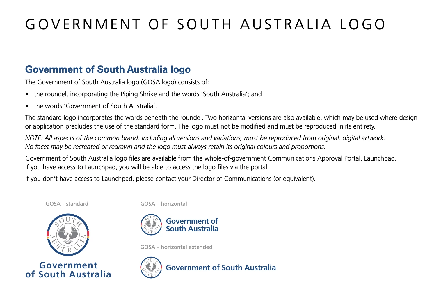
Even governments have style guides. This one from the Government of South Australia talks about the government logo and the various ways that it should be used in official communication. It’s a good example of how to create a guide around a very specific brand element.
Calvin Klein
This style guide from Calvin Klein is over 100 pages on how to use the brand’s logos. It’s super in-depth and is a good example of the types of things you can consider when using your logo, even if you don’t go into quite as much detail.
A brand style guide is a living document
Remember that your brand identity is a living thing that should evolve with your business and your customers' needs.
The key is maintaining consistency while being flexible enough to adapt to changing market conditions and customer expectations. Regular reviews help ensure your brand identity design remains strong and relevant while staying true to your core values and mission.
