Stand out and get recognized with email branding

Coca-Cola is more than a sugary drink. Its values, imagery and persona create a brand that connects with people's emotions. Your emails can do the same!
Email branding creates an aesthetic, a voice and an emotional connection that your subscribers will learn to trust. When you keep it authentic and consistent, people will instantly recognize your email in the midst of a crowded inbox.
Your email can be just another “sugary drink”… or it can connect in a more powerful way.
Creating your email brand requires two things: emotion (think personality, vibe, tone of voice) and imagery (think colors, logo, design).
It’s all about adding a unique, recognizable persona to your email marketing—but you don’t need to be a word wizard or a design guru to make it happen!
Consider this your guide to email branding that reflects who you are, and what you’re all about.
What is email branding?
Email branding is creating a consistent and unique design, along with a voice and personality that your subscribers recognize the moment they open your newsletter.
In short, it’s a blend of emotional and visual elements:
The emotional side of your email branding defines how your subscribers connect with your email. In the same way your friends like you for who you are, your emails can communicate personality, values, mission, culture and voice that your subscribers will connect with beyond just what you are selling.
The visual side of your email branding defines how your subscribers see your email. A brand identity is formed through your use of colors, logos, fonts, images and layouts. When you have a unique email aesthetic, you'll stand out from the rest!
Together, these visual and emotional elements create a branded email campaign that your subscribers will recognize from a mile away!
The power of email branding
Your email brand is more than a logo and signature color. It's the total subscriber experience that helps people remember you and form an opinion about you. When you create campaigns that subscribers connect with, you'll gain a powerful advantage over other emails in the inbox.
Email branding is also important for:
1. Your revenue: Email branding can increase revenue by 23% (according to research done by Marq)! The emotional connection makes people feel compelled to engage with you because they know you.
2. Your reputation: The better your company’s reputation, the more people you will attract. This also applies to the reputation of your emails—with the right branding, you can connect with the right people.
3. Your credibility: People do judge a book by its cover! Your email marketing campaigns will feel more professional (and reliable) when you use a consistent design and voice that reinforces your values.
4. Your uniqueness: It’s easier to find your friend in a crowded room when that friend has a distinct fashion or hairstyle that you’ve come to recognize. The same is true for your inbox. Email branding helps your subscribers immediately identify you in the crowd.
Whether you’re promoting an event, selling a product or collecting feedback, your email branding needs to be consistent across the board. Your brand identity also needs to be recognizable beyond email on other channels like social media, landing pages, web pages—and even on third-party websites. Once you’ve settled on your brand guidelines, make sure you stick to them.
Embracing your emotional side
Successful brands have a simple secret—they know that people are much more likely to buy when they combine the functional benefits with an emotional element.
Do people pay 3x more for an Apple computer because it's 3x better than a Dell? No! It’s because Apple’s design aesthetic, company values and personality make their customers feel something bigger.
Think about your brand persona: Do you want your audience to see you as a good friend, a coach or maybe a thought-leader?
Here are two ways to add emotional aspects of your brand:
Company values and culture: Do you have core principles, values, or social causes that are foundational to your company? How can you express these in your emails?
Brand voice: How do you speak to your email subscribers (tone of voice, language, overall persona, etc.)? Find your authentic voice, and don't be afraid to use it.
Define these two emotional elements by writing them out for your entire team to use and let them shine through in your email content. When people feel like they know you and share similar values, you establish a strong emotional bond that creates loyal customers.
Hint: You can also personalize your emails to make the messaging even more relevant to them—and boost open rates in the process!
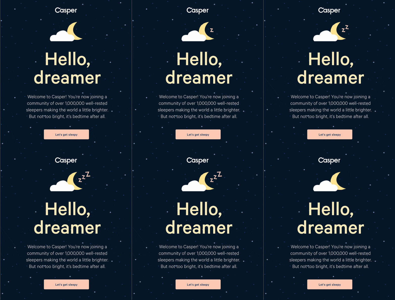
Take inspiration from this welcome email by Casper mattresses. The email copy is friendly and calming (e.g. “Hello dreamer”, “Let’s get sleepy” etc.), whilst also reflecting their values (“You’re now joining a community of over 1,000,000 well-rested sleepers”). This sets the emotional tone for their email branding from the get-go.
Let's get visual
The brain processes an image 60,000 times faster than text. Not 60 times faster, not 600x, not 6,000x—it's 60,000x! As a result, 80% of people remember what they see, compared to 10% of what they hear and 20% of what they read.
Using visuals like infographics, logos and photos will help you communicate and build your email brand.
Luckily, email marketing software like MailerLite allows you to design email newsletters like a pro, and you can save your branded templates to use over and over (hello, consistent branding)!
Let’s design a branded email together, now—then you have a template that you can use again and again.
1. Start with your own email domain
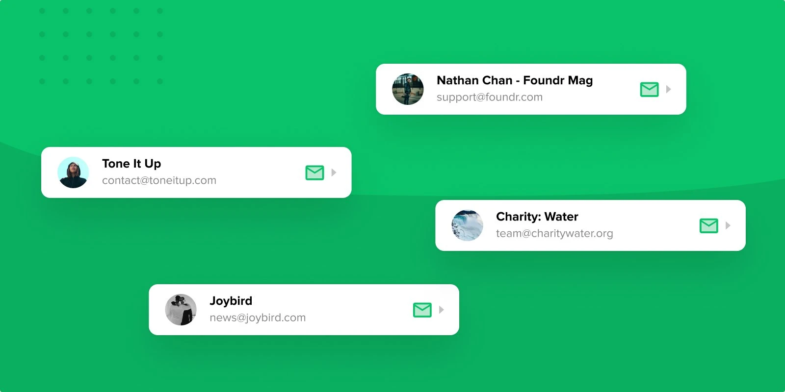
Let’s face it: an email from “sparkly.unicorn.1237@yahoo.com” just isn’t credible (sorry, unicorn lovers 🦄 ). Strong brands start with recognizable and safe-looking email addresses!
If you haven’t already, make sure you set up a professional email domain so that your subscribers can see that you mean business.
Use a custom email address with a format such as:
hello@companyname.com
your.name@companyname.com
info@companyname.com
contact@companyname.com
Free domains from email clients like Gmail, Outlook or Yahoo are not recommended as they have many limitations.
Instead, buy a professional custom email address through companies like GoDaddy, Domain.com, Google Workspace or WordPress (more on that here).
2. Incorporate your company logo
Your logo is the stamp of your brand, making everything you create instantly recognizable, including emails. Think of it as your unique symbol that is packed with meaning.
If you don’t have a logo already, you can create your own with a free tool like Canva, or hire a designer from our expert directory or a site like Upwork or Fiverr.
For your email branding, think first about how you want your logo to be incorporated. Will it be positioned above the header, where everyone can see it straight away? Or will it be in the top corner? The footer?
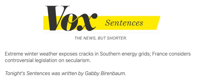
Vox includes their logo at the top of their newsletter, along with a tagline explaining exactly what they do. Clear, bold and simple!
(P.S. More information here on newsletter header design!)
3. Select your fonts and stick to them
The key here is readability. You might really like an artsy font, but if people can’t read the email message, then you’ve lost their attention already! Keep it simple, and your subscribers will thank you for it.
Check out this fun example from the marketers at MeUndies, an underwear brand. They use easy-to-read fonts, and it makes their messaging ultra clear!

4. Create your own color palette
Choose your color scheme and make it the signature of your brand. This will underpin the visual identity of your company, and it can also communicate certain feelings and experiences.
If you aren’t sure what color palette to settle on for your email, try a tool like Coolors to generate ideas until you find something that resonates.
In its email design, Paravel is known for its neutral, classic tones—with occasional pops of bright color! If you go to their website or view their product line, you'll see the same palette throughout their branding.

5. Define other visuals
Once you’ve settled on the logo, fonts and colors, you are ready to add content (text + visuals) to your newsletter design. This is the part where you can establish your themes, layouts, image styles, videos, your call to action, etc.
Here are a few visual tips for newsletter content:
Establish a theme: You don’t have to use the same exact layout every time but have an overall trend that marks your emails as your own
Use your chosen colors and fonts: This will ensure that your newsletter consistently follows your brand style and sticks in your subscribers’ minds
Break up the text with videos and GIFs: These are a sure-fire way to catch your subscriber’s eye and stand out
Try dynamic content: This allows you to display different personalized sections of your newsletter to different audiences
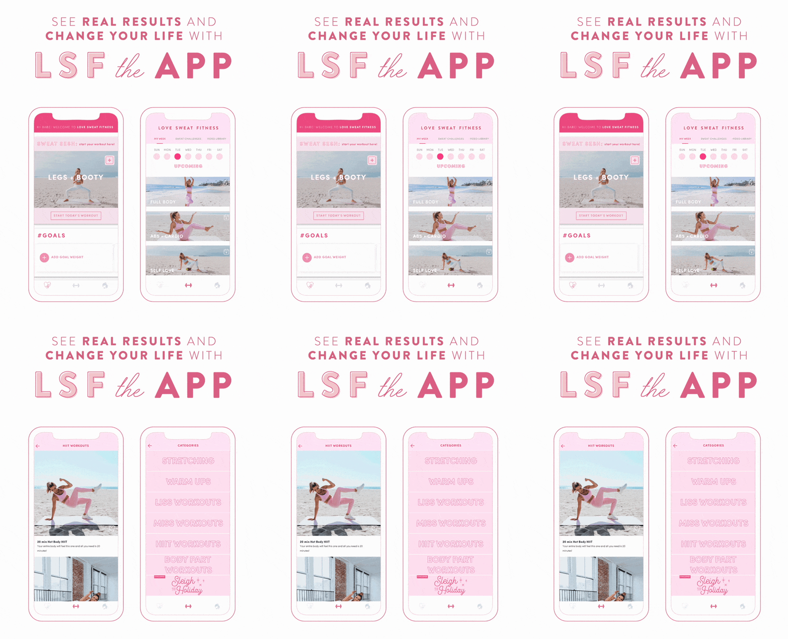
Love Sweat Fitness sticks with their pink color scheme in the images, text and font, but they also make their newsletter pop with this fun GIF, showcasing their app. All these visuals work together to define their email branding strategy.
6. Prepare your email signature
Many people skip signatures at the end of their marketing emails—which is a shame because they add a unique, personal touch to the end of your newsletter! Signatures are simple, but they can make all the difference to your email branding.
Before jumping straight to your footer and unsubscribe links, add an email signature that will resonate. It’s the last thing that your subscribers will see before they leave, so make it count (check out these 72 best email sign-offs for inspiration)!
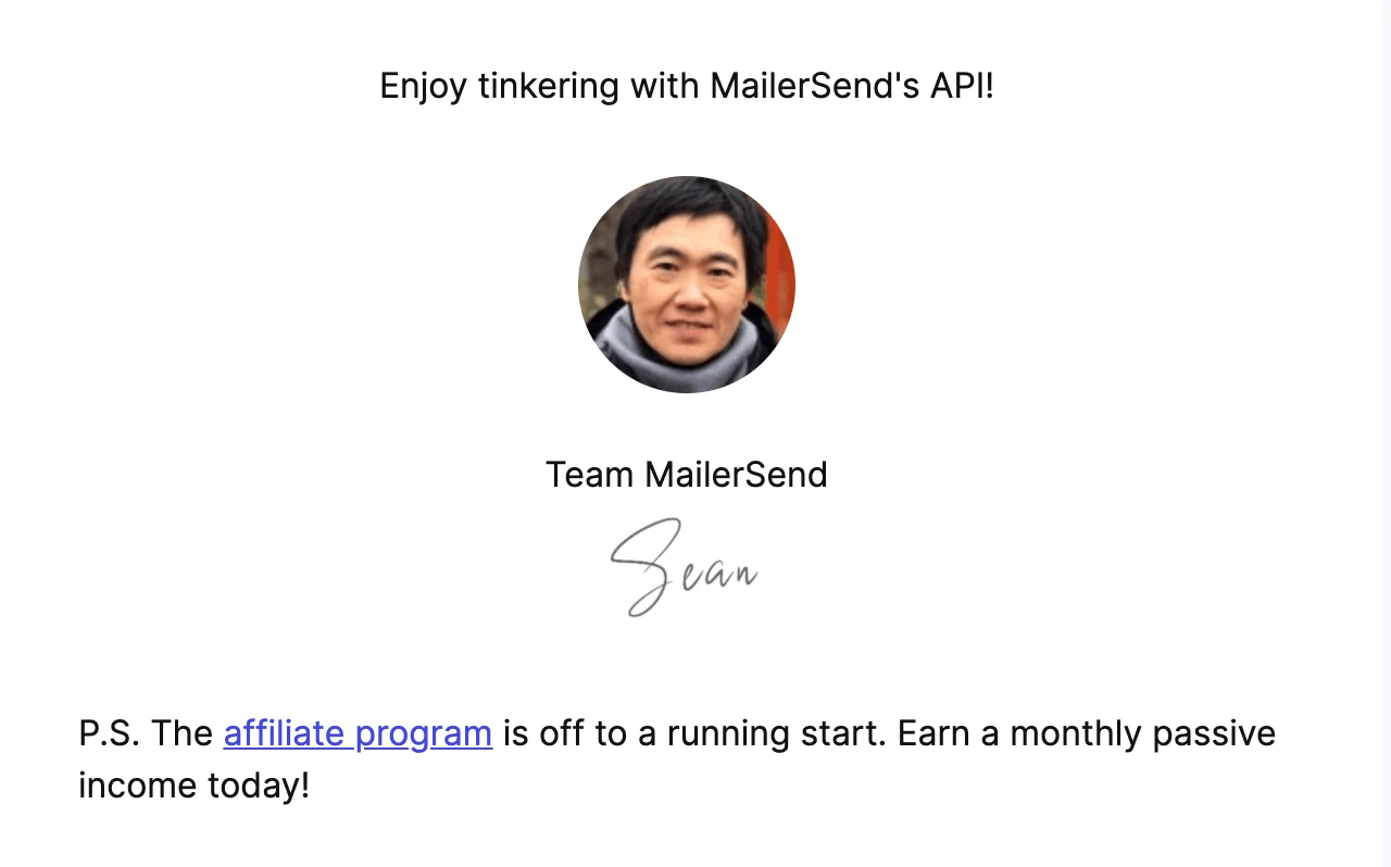
Our partners at MailerSend always end their emails with a sign-off, a profile picture, a signature, and sometimes a P.S. line.
7. Add company links
The final step is to keep your subscribers connected with your brand across all channels. This is the perfect time to share links to your social media profiles, your website and your contact information to keep the conversation going!
Joybird includes a link to their website (when you click on their logo), plus social media icons so that people can easily connect with their brand online.

Congratulations! You’re now an email branding pro
Remember—the key is consistency. Whatever you choose to do, maintain a theme so that your subscribers will recognize your branded email straight away.
Once you’ve defined your branding, save email templates to work from and create a list of guidelines for your team, to keep everything consistent across the board.
Identify the underlying emotion, voice and values of your brand
Set up a professional domain
Incorporate your logo into the email
Establish which fonts you’ll use—the clearer, the better
Choose a color scheme that matches your company’s identity
Add visual elements that follow a consistent theme and layout
Include a signature to wrap up your email in a memorable way
Share links to your website and social media profiles
Happy email branding!
