The 10 best ways to use embedded images in email newsletters
 Sthefani, People & Culture
They say images are worth a thousand clicks. Okay, we know it’s a thousand words, but email images are also amazing at getting subscribers to act!
Imagine you’re selling plane tickets to Hawaii. Sure, you’ll mention the flight details and the price… but you’ll win people over by embedding email images of the beautiful sunsets and sandy beaches! Those newsletter images will get people excited about packing their bags and hitting those waves.
It’s scientifically proven! The human brain processes images 60,000x faster than text and 90% of information transmitted to the brain is visual.
Newsletter images enhance your message and motivate readers to feel or do something, which makes them a crucial part of your email marketing strategy.
Let’s look at the 10 best ways to use embedded images in your emails and some examples from marketers that are doing it right.
1. Use images to illustrate your product/service
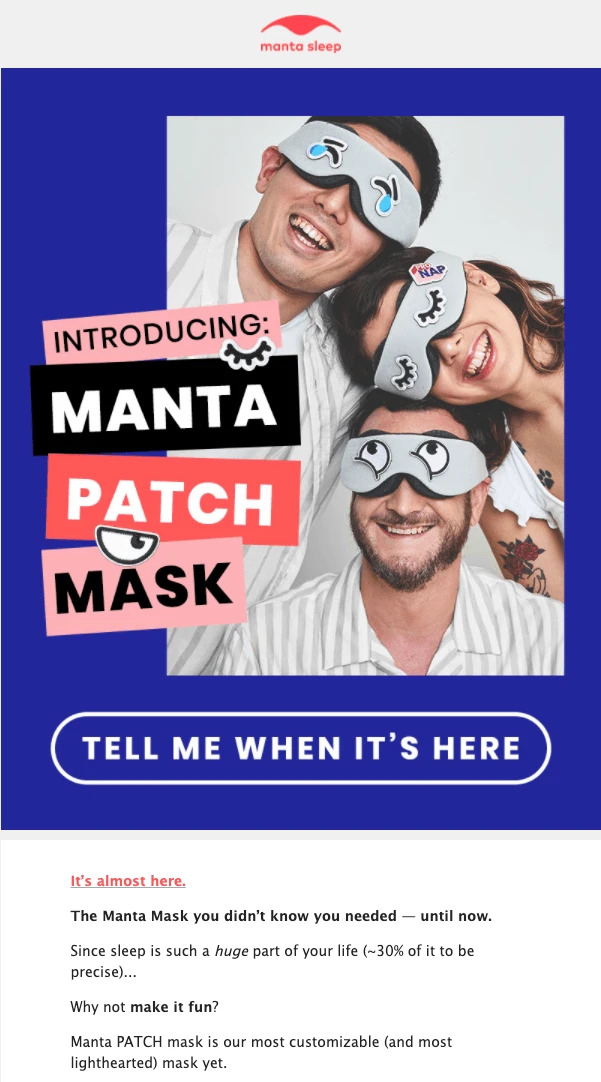
You can go into great detail explaining how your product or service works, or you can just show it with a single embedded image. In many situations, an image makes your message clearer and easier to understand. Especially in this meme-driven generation, our brains are trained to grasp the context of an email image immediately.
In this newsletter image from Manta Sleep, the reader immediately sees what their new range of sleep masks will look like (featuring fun patches that can be stuck anywhere on the mask)!
2. Use images to share the good news
Launched a redesign of your website? A new collection? Hit 100K followers on your social media profile? Or is your company 10 years on the market?
Celebrate your wins with imagery. On special occasions, you can even decorate your pictures by adding festive elements such as glittery details or balloons. Or use a flashy GIF to show your excitement. Whatever expresses your joyful mood best!
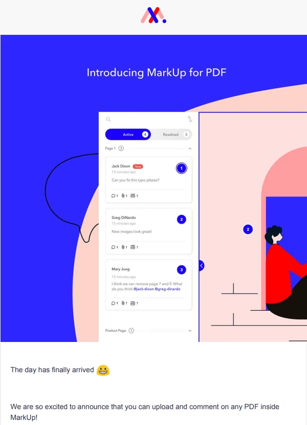
In the email design below, MarkUp announces their new feature with a beautifully illustrated screenshot to highlight the good news.
3. Use images as animated GIFs
Using GIFs in email newsletters can be another great way to add some visual interest and personality to your messages. They add some movement and life to static images, and help convey a tone or emotion that might be difficult to express in words alone.
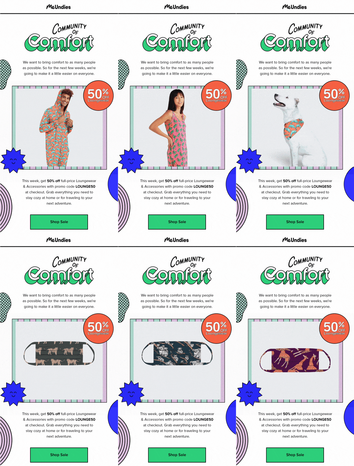
They also allow you to share multiple images while taking up the space of just one. Like in this newsletter design from MeUndies. By using an animated GIF, they’re able to show off 11 products while keeping the CTA button above the fold.
GIFs tell a story fast. If you’re releasing a new product or feature, GIFs in email are the perfect way to share the information quickly.
Learn more about the art of GIFs in this guide:
4. Use email images to set the mood
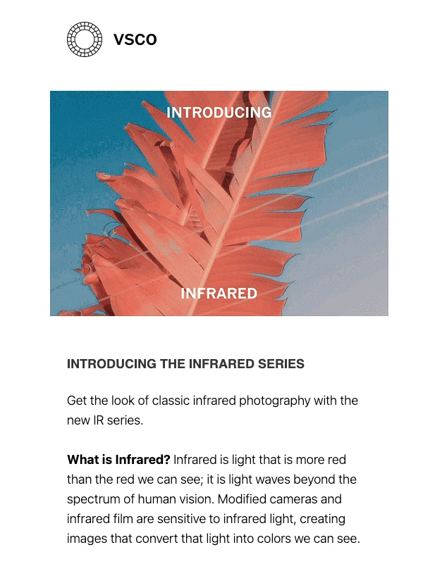
Email marketing images are great for immediately setting a mood, just like the example below from VSCO. When they’re announcing their new Infrared filter series, the high-resolution email picture instantly sets the mood and shows how you can transform your own photos.
5. Use seasonal images to celebrate
Christmas? Summertime? Halloween? Seasons and festivities are excellent reasons to embed images into your email.
Pulp&Press celebrates Valentine’s Day by giving their email newsletter a romantic touch, featuring an image of their products in the shape of a heart. ❤️
A well-timed seasonal email will resonate with subscribers, and ramp up engagement in the process.

Want to level up your seasonal email planning? Read the article below to learn how to use an email content calendar to map out your newsletters and email marketing goals for the year. (Plus download our free content calendar template)!
6. Use images to engage with your readers
For your next event or competition, why don’t you add an image to your newsletter explaining the rules instead of listing them as text? This is a fresh alternative and something that will catch the reader's eye.
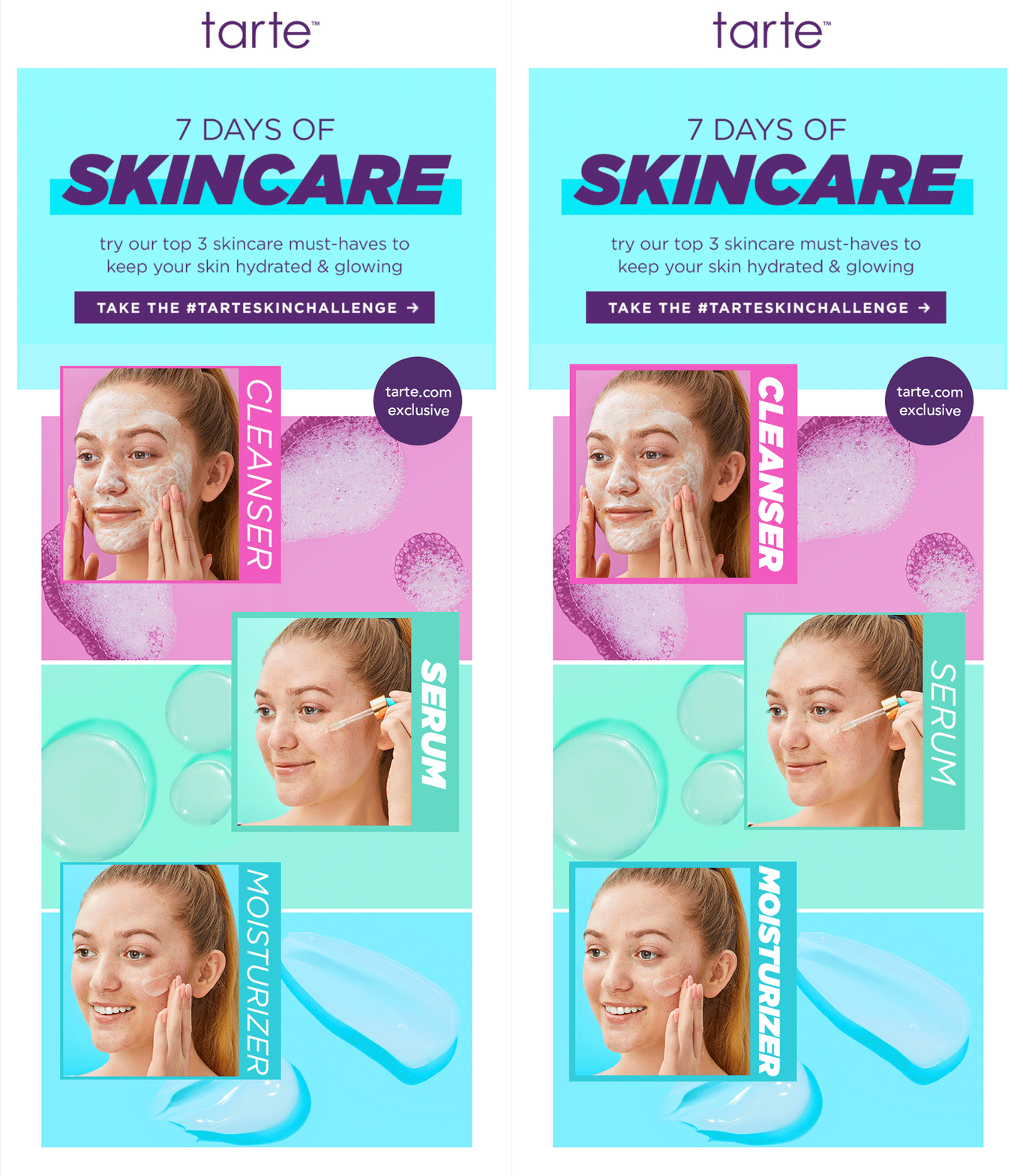
Makeup brand tarte encourages its readers to join their skincare challenge. The high-quality images draw the reader in and show exactly what steps are expected from the subscriber.
7. Use images to appeal to your readers’ senses
Quotes are powerful and widely shared. Quotes on email pictures? Now that’s a winning combo! Especially when these can be shared on social platforms #motivationalmonday.
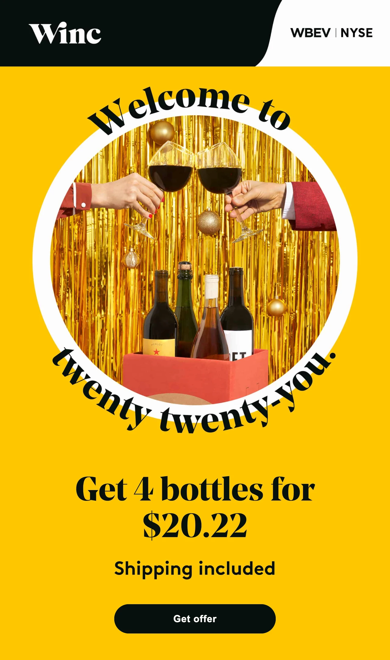
You can use text on embedded images to appeal to your reader’s senses. Winc combines their clever headline with a celebratory image, which acts as a great header for their email message.
8. Use images to reinforce your message
Drawings and little cartoons are another good way to easily get your message across. When you think about it, that’s how children start learning about things early on too.
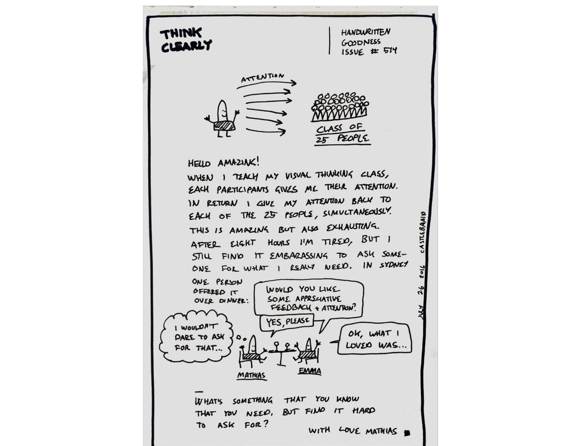
In the example below, Think Clearly embeds handwritten notes and doodles to convey their message. This is much more captivating than using typed text. Subscribers will be pleasantly surprised to see this in your image email newsletter.
9. Use images to build brand authenticity
Alternatively, you can visually communicate your brand identity by including high-quality images that align with your brand values.
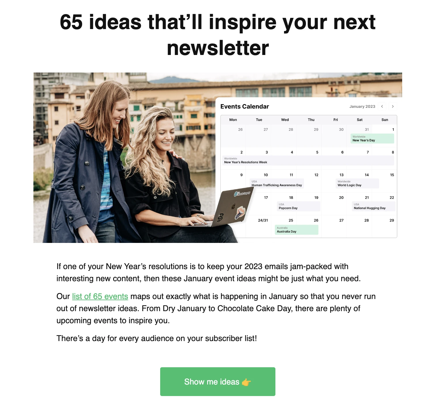
For example, using images of real people, such as employees or customers, can add a personal touch and make your brand feel more relatable and trustworthy. That’s exactly what we do in our very own newsletters. Did you know all of our images are of MailerLite team members?
Meet Milda and Izabella from our People & Culture team!
Want more ideas for building brand authenticity in your emails? Check out the article below:
10. Use images to ask questions
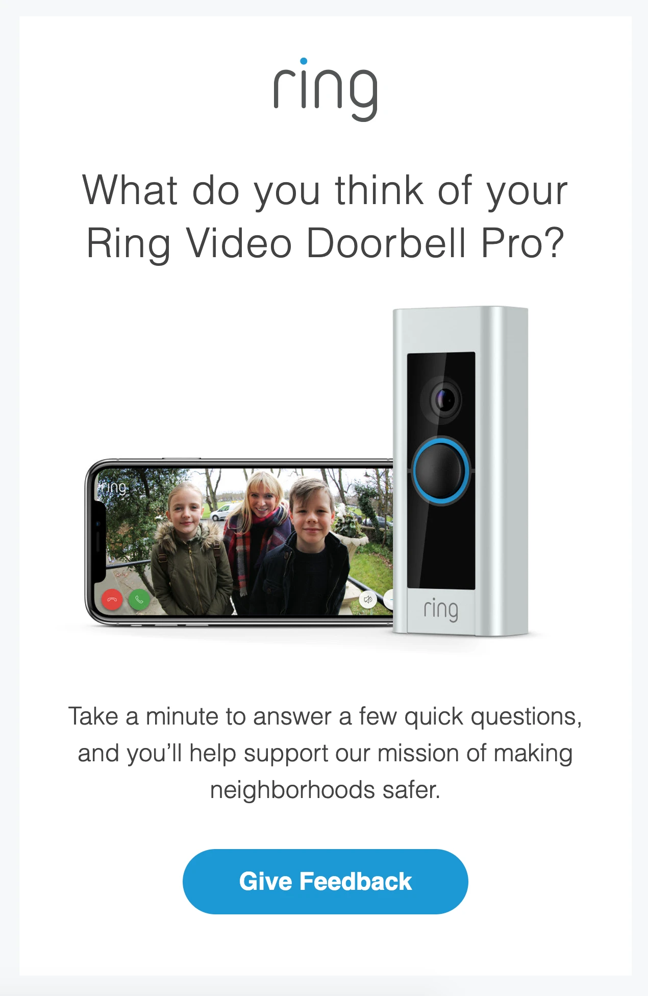
Do you have an important question to ask and need it to stick out from the rest of your email copy? By placing your question in a bigger font on a background image, your question will stand out.
You can pair this strategy with a survey block in your image newsletter. When you use MailerLite, you can easily implement a survey in your email and get your question answered without the subscriber ever needing to leave the email. In your reports, you’ll see exactly what email subscribers have answered (and you can analyze the answers directly in our software).
More inspiration for email images by industry
Our collection of in-app newsletter templates is constantly updated with fresh inspiration. Check out the professionally designed options we have available for your email marketing campaigns, including industry-specific templates like e-commerce, events, health and wellness and more!
7 best practices for using images in email newsletters
1. Always add ALT text
The best image newsletters always use ALT text! Though email clients are constantly updated and improving, some email providers don’t display images by default. In this case, readers only see the ALT text (short for “alternative text”) attached to each image. This text explains to your readers what the image is about. You can use a descriptive ALT text, or get more creative and use this piece of text as a CTA.
Here's how easy it is to add ALT text to an image in MailerLite:

2. Follow image size best practices
Email clients have restrictions when it comes to the width of each email template, namely 600 pixels. Therefore, it’s best to fit the image to the email and stick with a maximum width of 600 pixels. If you are optimizing for Retina and other high-density displays, pay attention to our image size recommendations.
Keep each image size under 1MB, but aim for as low as possible (100KB or less). When you have a .png or .jpg file, you can reduce the image size with an online tool like tinypng.com. The quality loss is often unnoticeable. This makes sure you don't take up much of your reader's data.
Be aware that your newsletter image shouldn’t be too long (it isn’t a web page, after all)! Otherwise, it’ll automatically become smaller when users view your email on tablet or mobile. If the height is long and the image is scaled down, you risk the chance that your images are not readable anymore.
Though reducing image sizes is a good practice to reduce data usage for readers, it doesn't solve things when your newsletter gets clipped in Gmail. When this happens to your email, you'll have to delete images or elements to make your email shorter, as the clipping is caused by the email's length.
Gmail looks at the total number of bytes in the email's code. The longer your email, the more code is used and the higher the chances of your email getting clipped. Deleting images (and thus pieces of code) will solve your issue.
3. Use a mobile-first approach
Nowadays, the majority of people read their emails on a mobile phone. Which is why you should choose your images for this device first. When your images are easy to read and see on mobile, you can rest assured they’ll also look good on desktop. One practice, for example, is to make the fonts on pictures large enough so they’re readable when scaled down to a mobile screen.
4. Keep a good balance between images and text
As much as we love using images to enhance a message, it shouldn’t take over the entire email. Make sure there’s a good balance between text and images. A good rule of thumb is to make the ratio ⅓—1 part of the email images, and 2 parts text.
This is not only more pleasant for the reader, but having plenty of balance also makes your newsletter look more professional.
If you aren’t sure how to space out your text and images, check out our newsletter templates gallery for inspiration!
You can also use background images in your emails, but they should be no larger than 1MB, and responsive for different screen sizes.
Just remember, it’s important not to have image-only newsletters. Here are three reasons why:
Difficult to locate in the inbox: Image-only newsletters might look nice—but what if your subscriber wants to look up your email later? There won’t be any keywords to help them, and your newsletter will be lost.
Images are automatically blocked by some inbox providers: Meaning that if you send an image-only newsletter, your subscribers will just be greeted with an empty email (awkward 😅 ).
No preview text available: So subscribers won’t be able to have a sneak peek of what your email is about, unless you add some text to the preheader.
5. Use an online tool if you’re not sure about your design skills
Don't worry if your design skills aren't quite at the level of a professional. Everyone can be a designer these days (or at least fake it until they make it) by using an online editing tool. If you're a MailerLite customer, use the built-in photo editor in your MailerLite account.
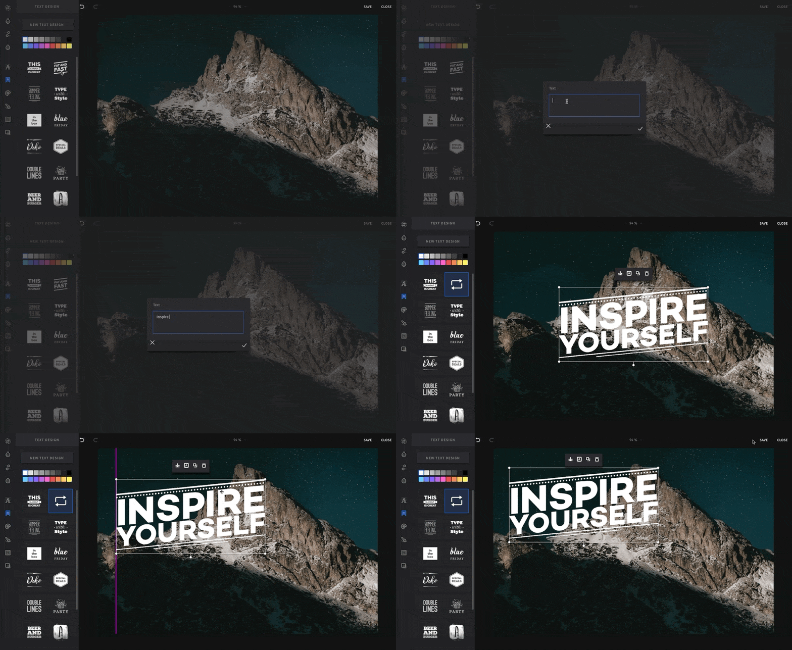
Or you can try services like Canva and Mega Creator. Canva users can access our integration to export images right into MailerLite from the Canva editor. Just choose the MailerLite option from the design tool's share menu and follow the steps. Click here to see full instructions and find out how to use Canva in email marketing.
By using a ready-made design and editing them with your own text and images, you can create email images like a real pro.
6. Place your CTA text on a button, not on an image
CTA’s are the most important part of an email because they encourage your reader to take action. But if your image doesn't load, people won't see your CTA and won't be able to do what you want them to do. Avoid this by inserting your CTA as a button, not an image.
7. Watch out for images that scream stock photo
The images you use in your email should complement the text. While it's best to use original images, stock photos can help illustrate your point when you don't have any photos at hand. Just be sure to choose high-quality images and then use our photo editor to further tailor them so they fit your email branding.
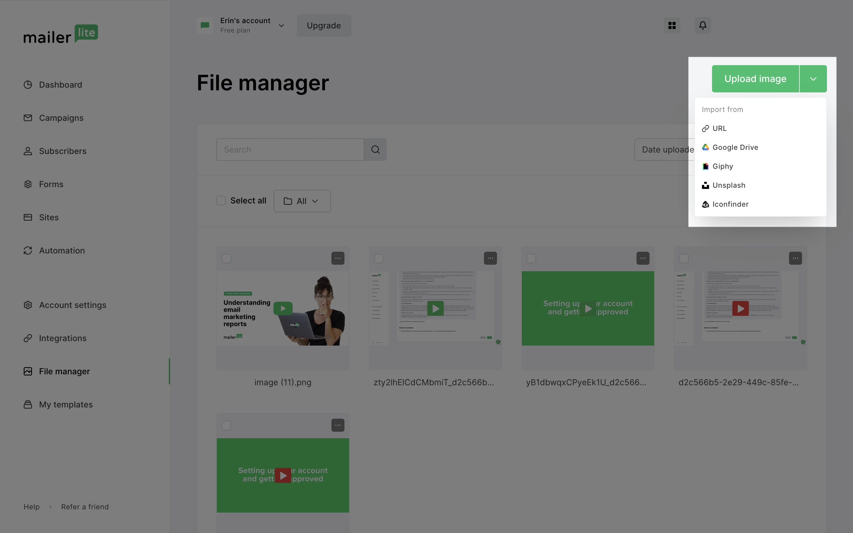
Watch this video to learn everything there is to know about inserting, editing and managing newsletter images in your MailerLite File Manager.
A final word on using images in emails
Email images will get your message across, increase email engagement and encourage action.
Remember—don’t just add an image for the sake of having one there. 😉 Make sure it elevates to the rest of the newsletter and helps achieve your end goal.
Have you ever tried MailerLite's built-in photo editor? It's free on all accounts! Sign up and try it out today.
Editor’s note: This post was updated in January 2023 with newly added insights and examples to help you design the best emails!
